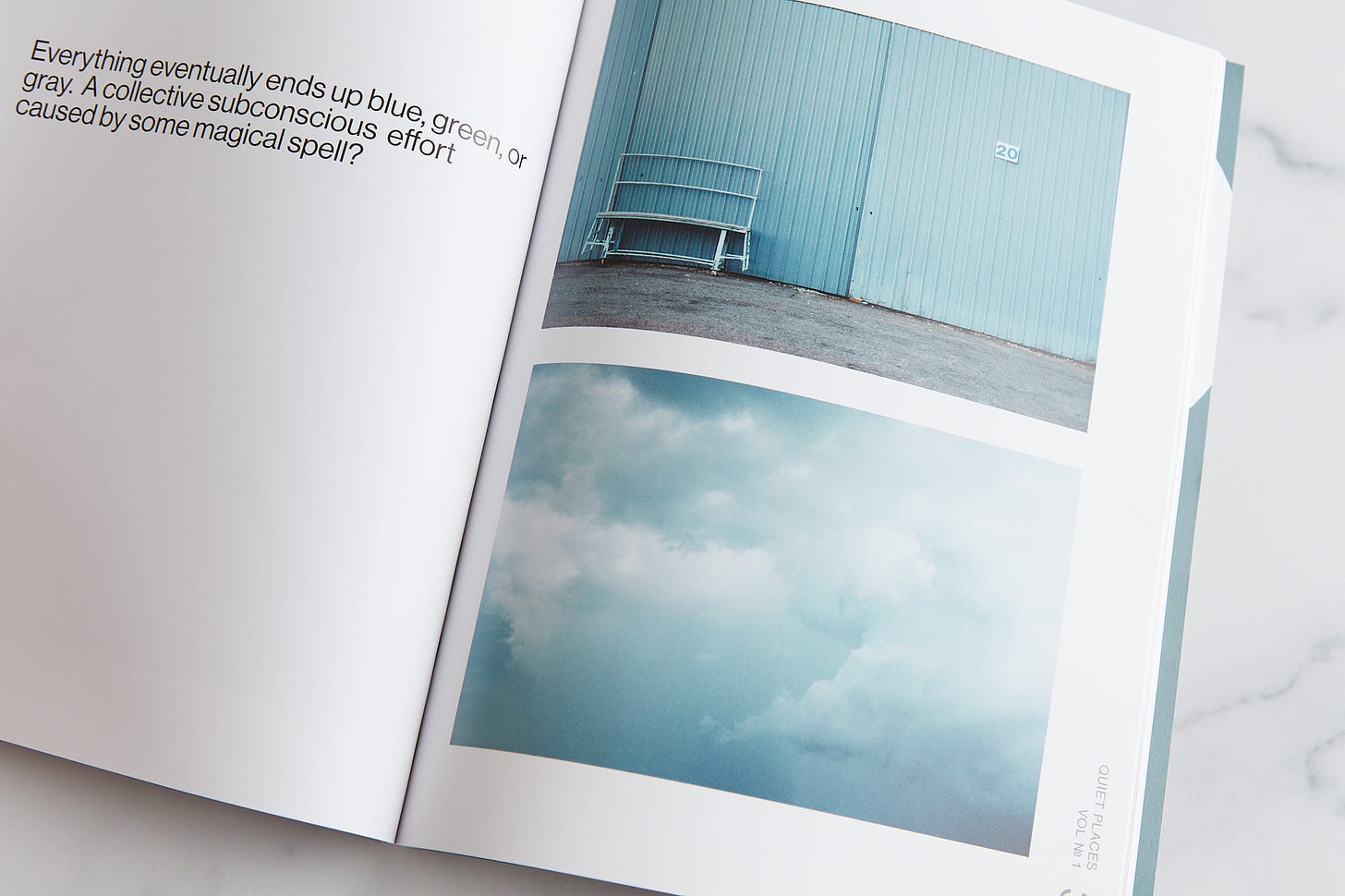
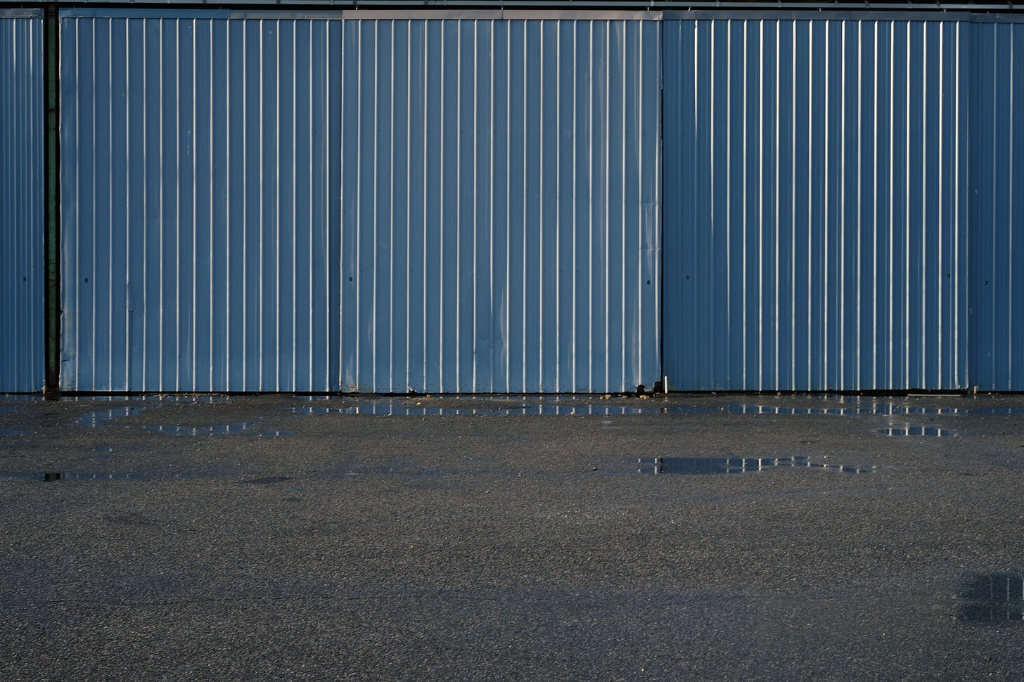
I’ve struggled with what seems to be a simple decision since the first draft of a project started during the summer of 2021. While putting together my first printed proof magazine/book I tried many layouts and juxtapositions of the two photographs illustrated above. I’ve tried side by side on opposing pages. I’ve tried both on the same page. I’ve tried them following each other after a page turn both as single pages and as full spreads as they are horizontal images.
Every draft I’ve printed, and every layout I’ve tried seems to work but I cannot decide which one is best. Maybe I’m wrong and they don’t belong together but the story I want to tell in many ways is about color. The color of this place I live and one’s perception of it is unique in many ways and changes both by season and in an instant during the summer based on a passing thunderstorm.
These two images illustrate how the water, the sky, and a ubiquitous paint scheme around the bay mirror each other one moment and then gloriously contrast with completely different perceived saturation minutes later when the clouds pass and the sun shines. The spread after these two images shows the same building as I waited out the rain under a nearby shelter.
Don’t dismiss this decision as trivial. Editorial and curatorial decisions like this count a lot. They count no matter how many images you are displaying or presenting. These decisions are even more important when presenting any more than one image. What is the context you are presenting the photographs? Do they belong together at all? What relationship do they have with each other? Should one or more be larger than the others? What order should they be in?
Obviously, this counts when presenting them in a fixed order like a book or magazine. It also applies to a portfolio. It applies when you hang them on a wall or show them in a gallery. There is a reason gallery curators get paid and the good ones get paid a lot. The same is true of photo editors. That job goes way beyond the mere selection of pictures. The job includes all aspects of presentation. Curation is an art.
The vast majority of this community are photographers. Think of your own editorial and curatorial decisions in photographic terms. Is the composition of your photograph important? Of course, it is, we discuss it endlessly. We criticize bad composition and celebrate good composition in a photograph. It may be why most of our photographs don’t work. We constantly try to improve that skill that you cannot quite put your finger on but when a photograph’s composition works you know it.
What is composition in terms of a photograph? In the most basic definition composition is what elements you put in a frame and how those elements are arranged and related to each other. Where those elements are, how big they are, what they are and why are they there. These are the basic things we make decisions on when making a picture. Curation of presentations of your photographs is the same exercise and you should think about it the same way, with the same degree of importance. Any occasion where you display your work is a compositional exercise.
What Do You Think?
So, which way would you arrange the two images at the top? Would you do something else? Maybe one of the other ways I described or better yet something I didn’t consider? Let me know in the comments if this is not the best way.
End Notes
I’ve not finished this project. I started it as a challenge to myself as this type of project is far outside my wheelhouse. It’s also a challenge as the Chesapeake Bay area is universally considered beautiful but is notoriously difficult to photograph. My approach was the attempt to capture how the area feels and why so many people spend so much time here in the summertime.
I planned on finishing the summertime season in 2022 then moving on to other seasons, gradually working up my stamina to do winter (I am not fond of the winter, to say the least). I didn’t make a single photograph in the summer of 2022. My mother unexpectedly passed a few months prior and I couldn’t bring myself to make photographs of the area. The bay and living near it was a big part of my Mother’s life since childhood. She was my editor when I started the project. I couldn’t work on it any further while I was grieving.
This summer I plan to approach it with joy as my memories bring so much of it now where it only brought pain last year. Many photographers and artists are inspired when feeling grief. I am not one of them but those emotions and memories can and usually do turn into joys which I plan to embrace as I work on this project in 2023.
#ideas #draft #paperarts


As most of you know, I've worked side-by-side with Bob for about 14 years now. I'm glad he's shared with you his technical expertise, but also his artistic sensitivities and how his mother's passing affected his work (don't our emotions affect all our work?). I can tell you that Bob takes his photographic passions seriously.
In this particular case, I remember Bob bringing in the first and second drafts. My take on it is that it is a prime example of artistic intent. The simple answer is to put the clouds on top and the wall/bench on the bottom. That grounds the page. The solid bench and the immovable wall ground the ethereal clouds above. Like I said, simple....yet...
By placing the clouds on the bottom, I found that it created cognitive dissonance for me. And that is not bad in a viewer. It causes more time spent, deciphering, decoding, dealing with our discomfort with that dissonance. I was forced to think of why the artist did this. It made me look longer and deeper and then the color and hues hit me. Yes, THAT was the artist's intent after all. Color. Hue. An interpretive image conveying his feeling about place.
So, all I can say is that we spend a lot of collective time in our studio listening, arguing, rethinking. Curation is critical. Few things can spoil a presentation as easily as thoughtless curation.
It's hard to separate what you have in your book from what I now know about the photographs. Had I not read your article, I may not have seen the relationship. I'm a bit of a visual Visigoth, I guess. But from that insensitive perspective...
You've chosen to print these two photographs in a higher key and bluer hue than they were in nature, based on the one photo in your article above. That's consistent with your text on the page facing the photographs in question. Are the other photographs in the collection similarly altered to blue, green or gray?
In the text above, you mention a passing storm. I'm guessing that the cloud photograph would be from that storm or some other. The puddles in your original photograph of the wall are more obvious than those in the photograph in the book. Having seen it and with what you said about the storm, the relationship between the two photographs in the book is more apparent: they are related causally and emotionally. So I think the two photographs as presented would work better together if the puddles could be made a bit more obvious. For example if the puddles on the gravel were more silver like the ones immediately adjacent to the wall, they'd be more recognizable. In that case, I'd leave the two photographs in their current orientation.
I am interested in seeing the book when it's finished!