About two years ago I started a series about self-publishing for photographers. I expressed a few thoughts on self-editing, constraints, and practical evaluations comparing various on-demand printing services. Throughout that series, I used a personal project focused on my local environment to drive those thoughts and evaluations.
Here we are two years later and that simple, constrained project continues to fuel, refine, and inspire my current work. I am again focusing on my local area, its feel, and its flavor but this time in a more abstract way. The working title for the project is ”Water Colors”. The specific theme is distilling the color palette of the Chesapeake Bay area within the context of making some sort of compositional sense out of what seems to be visual chaos at first glance.
Although I am at the very early stage of making photographs for this project, I’ve produced enough material this spring to start evaluating what I want the final output to be. I am even contemplating what papers might best represent my artistic vision for that output.
The Genesis
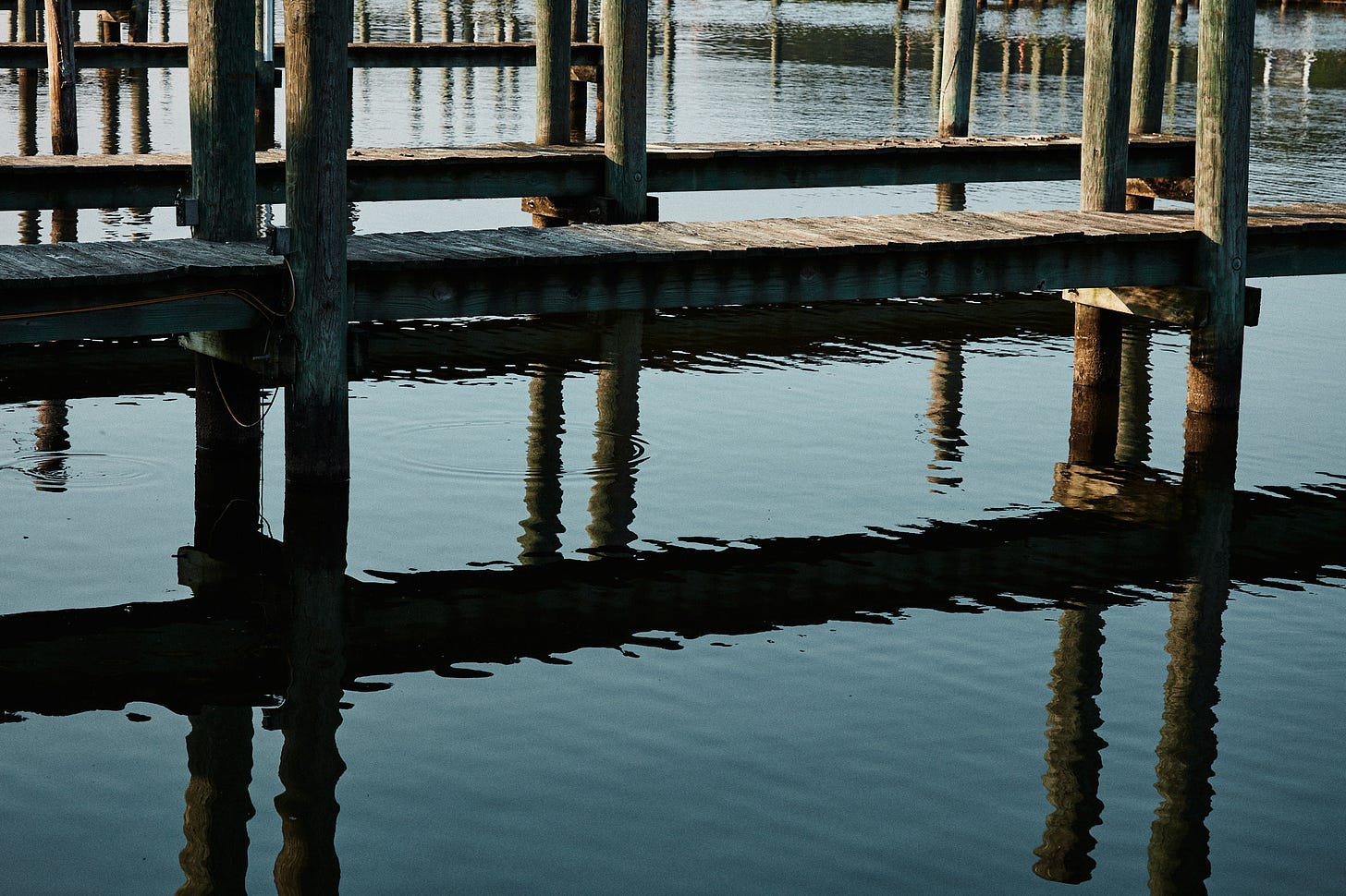
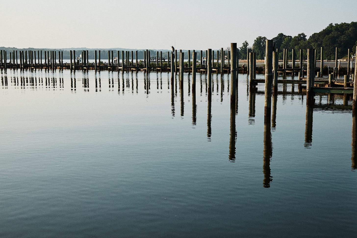
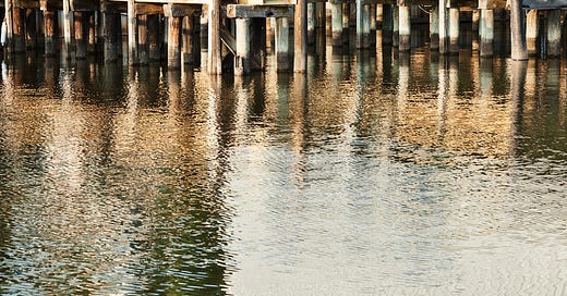
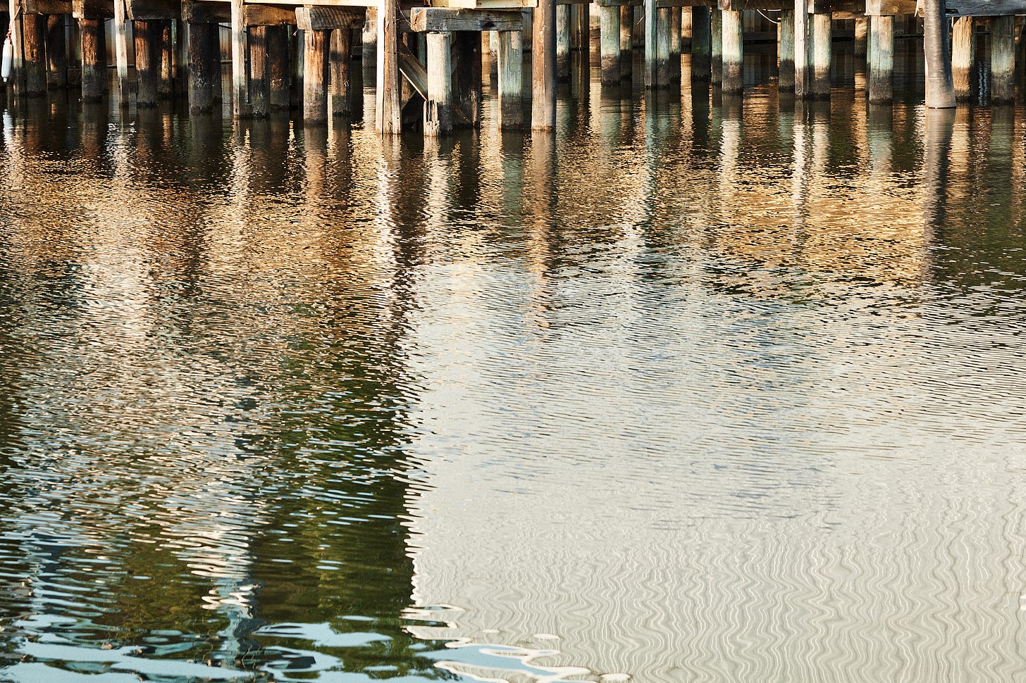
As of today, I’ve made just under fifty small proof prints using my Canon Selphy 4” x 6” printer on glossy paper. I’ve included a few of those here to illustrate the overall color palette I’m working with to this point, the range of highlight and shadow, and the graphical nature of the photographs.
If I were to evaluate these individually and fine-tune my paper selection without regard to others that would be displayed side by side I’d probably make a different paper decision for one than I would for the others. For the first photo, I may use a semi-gloss or baryta paper with punchy, saturated color. A couple of the other photos look good on that family of papers looking at my small proofs but at least one of them is calling out to me for a muted matte paper with some texture. I can even see one of these and a few others I’ve not included here on Slickrock Silver.
Thinking In Terms Of The Presentation
How might one reconcile the “perfect paper” pairing between images that may individually be “optimal” on wildly different papers? The primary principle to focus on when starting to think about paper selection for a photograph destined to be presented as a collection is that the viewing audience will not be doing a side-by-side evaluation as you probably will be. There will be no context for them to evaluate those same images or even one of them on differing mediums.
I’d strongly advocate for visual harmony when presenting any collection of related work. That’s far more important than optimizing one particular photograph. Where does that leave us when selecting a paper for the final presentation in print?
I’m not even close to making that final decision for this project but I am being pulled in a direction based on the editorial selection and small proofs I’ve made so far. All of the color palettes are limited, subtle, and overlaid onto strong geometrical patterns. The primary question I’m asking myself is do I want to pump up the colors or mute them further. A closely related question is do I want to bring those geometrical patterns forward or tone them down? The answer to both of those questions lies entirely with how I want those prints to feel.
Developing Your Vision For A Project
My vision for this project is to convey the softness, peace, and calmness one feels as I did when walking these spaces and viewing the scenes I pointed my camera at. For that intent, I’ll be tending toward softening both the color and geometric patterns. I’m leaning towards a matte paper with a lower d-max. I’m not at all near a point where I can speak to paper texture yet.
Now I have a loose vision of how I want the final prints to feel based on the work I’ve done so far. What’s next? How do I go forward in pairing work with paper? Where exactly am I in this process of developing a project and a presentation?
There’s no set sequential set of steps like a fixed recipe. There are a few obvious things to do at this early stage. The first thing is to set my very first constraints for the output. How many prints do I want, how big will they be, will they be mounted and hung or will they be in a more intimate form of presentation like a portfolio?
I am not at a point to decide on size or even mounted and hung or portfolio yet. I am at a point where I believe 20 prints is the right number I need to convey the theme of abstract color palette and geometries I see in a way that fits with my vision. I also know at this point I’ll be using a matte paper of some type. As a baseline, I’ll start making a few proofs of the most divergent photographs I see as candidates on the matte paper I have the most experience with. From there, I’ll play with a few comparisons of materials I know to have a softer rendition. Then I’ll live with those few proofs for a while.
As I live with those proofs I will use them to inform my editorial decisions with the work I’ve done so far, narrowing down my current selection. I’ll make a couple of more proofs to add to what I have. I’ll vary the paper selections in a direction that suits my vision. It might surprise some of you that those proofs which inform my editorial decisions will also inform the camera work, composition, and what I am looking for as I venture out to make more photographs for the project.
Not Always A Straight Line
Go make pictures of a particular subject (field work)
Decide which ones you like (editorial work)
Decide what paper to use (aesthetic decisions)
Print pictures on said paper
Done
Projects do not always have to be a straight line. Your overall “body of work” will not and shouldn’t be a straight line. Projects can and do evolve with the latter informing previous steps. Editorial decisions inform output decisions, which inform producing more work in the field, which inform editorial decisions which inform output decisions.
Stay tuned I’ll post updates, changes in course, and thoughts on image and paper pairing as I continue work on this project as I go forward. I plan on finishing this before the fall of 2023 — another constraint, and an important one.


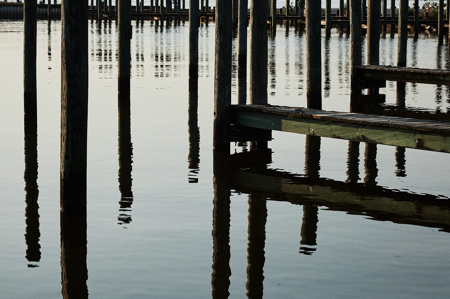
I often think about my paper when taking the photograph. I sometimes know how I want it to look at the end based on what I’m seeing. Whether it behaves in accord to my vision is another thing.
I've struggled with similar questions when trying to decide how to display a series of infrared (wavelength > 720 nm) converted to B&W images. I decided to go with a matte paper to tone down some of the contrast, which seemed to be getting too high with platine or baryta papers. BUT (shout intended) the differences between the paper types were muted once the prints went behind glass.
I know some people who are playing with matting and framing the print without glass or plexiglas. That certainly allows the character of the paper to make a larger contribution. And it certainly lowers the cost! It also brings canvas into the conversation, although the range of canvas surfaces is much smaller than the range of paper surfaces.
Shipping photographs without glass probably requires coating the prints with varnish to protect them, introducing another variable. As the number of variables increases, so does the need for therapy...