Finally, the last comparison of baryta papers is ready The last paper on our list for comparison is from Red River. Neither I nor Les have used a Red River paper prior to this comparison. Sure, we’ve heard favorable things about the company and some of their products, we’ve just not tried them or knew anyone personally that used them.
Red River made our list based on the survey we published, and probably represents most of the “other” category given its praise in the comments. Why so long to wrap this up? In large part due to software issues inflicted on us by Adobe. The other part was availability of 8.5” x 11” Red River baryta papers. I may have dreamt it but I could swear that size was available two weeks ago. When we went to purchase a box it was out of stock… again.
We bit the bullet and went the next size up. We grabbed a box of 9” x 13” to finish up the comparison. Who uses 9” x 13” paper? Seriously if any of you use or even has a clue where that sheet size originated please let me know in the comments as I’m curious. In all seriousness, the availability of Red River baryta papers may be a valid criticism and concern if you plan on using it for a project. Take the advice we published a while back regarding materials before committing to a particular paper on important print projects.
Moab Juniper Vs Red River Big Bend Baryta 310
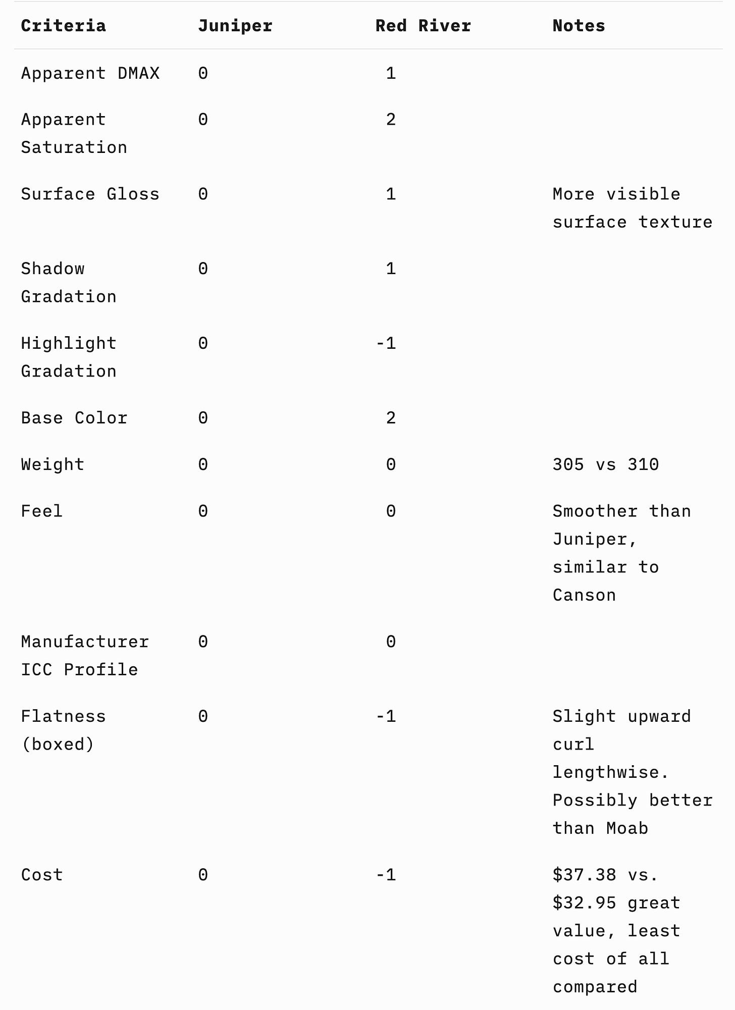
As noted, the Red River is a great value being the least expensive of all papers we’ve tested in the category. The paper is extremely close to Juniper in weight and cost. The biggest difference is in surface texture and whiteness compared to Juniper.
In our GTI viewing booth the Red River Big Bend Baryta 310 seems to the the brightest paper of all that we tested. On its own, the base color would be about the same as the Hahnemühle Fine Art Baryta but side-by-side the Red River seems to be a hair brighter. If you prefer very white paper that veers toward papers with obvious OBAs this is a good thing. If you prefer a more natural looking paper Big Bend Baryta is not going to be your cup of tea. It would be a bad idea to pair prints using this paper with those printed on Juniper or the Canson Prestige II. The difference in base color would be significant.
Curiously, the increase in saturation of some colors like deep reds without a side-by-side compared to Juniper doesn’t seem to correlate to the DMAX, instead it seems more related to the base color. Much like the Hahnemühle Fine Art Baryta, the Big Bend Baryta might be your paper if you’re looking for a bit more saturated color.
Conclusions
If you are using any of these papers we’ve compared, don’t be too anxious in thinking a different one will revolutionize your output. There are definitely differences worth considering based on fine tuning how you render your art. I’d not worry one bit regarding any minor differences in highlight or shadow rendering. The same is true of DMAX. The differences are so minor they don’t amount to anything that a tiny post-processing tweak wouldn’t render moot.
The saturation and base color differences are bigger and I would definitely consider those when making a choice.Brighter/whiter base color seem to go hand-in-hand with more saturated color. If your work benefits from a bit more saturation Hahnemühle Fine Art Baryta or Red River may be the tweak you’re looking for. On the other hand I do a lot of portrait work and now would definitely pick Juniper or Canson Prestige II as I like the more natural base and slightly less saturation.
The feel and difference in surface gloss or texture are minor but definitely there. Personal preference will guide your choice here. Again, my choice out of all of the papers in terms of feel, surface, and other properties would be the Canson now that I’ve inspected it. Les’ overall choice would be the Juniper for most of his work, but one of the others for specific subject matter. This may be entirely due to my nostalgia of the air dried fiber glossy papers I used in darkroom printing and how much the Canson reminds me of a couple of those.
One last consideration is entirely operational in our studio. Weight, stiffness, and flatness combined. The Hahnemühle Fine Art Baryta would be tough for us to choose in sheets. We print a lot of sheets in Canon ProGraf 1000 printers. The Hahnemühle will absolutely not run through the top feeder without marks and print head strikes. We’d be forced to use the single strait-path rear feed. In reality that would be fine for slow paced printing but would not work for us at all in workshops where we make dozens and dozens of proofs and final prints on sheet paper. On rolls this wouldn’t be an issue for large print sizes but is a consideration depending on your work-flow and specific printer.
Stay tuned, I plan on putting together a comparison guide for all the papers we tested. I hope it will be a way for baryta paper users to quickly see how any of these compare to your own go-to choice.
Evaluation Criteria (for convenience)
Since we’ve been using Moab Juniper for years, all comparisons will be relative to that. We didn’t want to make these comparisons with a perspective of better or worse. Instead, the focus was toward qualitative characteristics that will allow those who use one of the papers (Moab Juniper or Canson Baryta Prestige II in this case) to get a sense of meaningful differences and how those would relate to your work.
We didn’t develop or perform technical metrics as those typically don’t translate to what a print will look like. Instead we developed a list of visual criteria that most of us would consider when critically viewing two otherwise identical prints side-by-side. We also threw in a few practical criteria when using the papers. Here’s the criteria we settled on:
Apparent DMAX (how black are the blacks)
Apparent saturation (typically this goes hand-in-hand with DMAX but there are exceptions)
Surface gloss
Shadow gradation (lower quarter of the histogram separation)
Highlight gradation (upper quarter of the histogram separation)
Base color (cooler or warmer relative to Moab Juniper)
Weight (the density/weight as well as the actual thickness)
Feel (somewhat subjective feel in the hand with a description)
Manufacturer ICC profile (how good or accurate is it)
Flatness (for cut sheets)
Cost (relative to Moab Juniper)
Any relevant notes for printers we discover that don’t nicely fit into a criteria
We decided to use a numbering system so at the end of this odyssey we’ll be able to publish a quick comparison guide that will point printers in the right direction based on what paper they are familiar with. That numbering system puts Moab Juniper at base-zero in every category. The paper we compare will get a score either less or more than 0 indicating the direction of variation from Juniper. We used minus 3 to plus 3 as the arbitrary values. A magnitude of 1 either way is a very small difference noticeable when comparing side-by-side on the same exact output file, and as inspected in a large GTI Graphiclite viewing booth. The magnitude of 2 means a significant difference that’s very noticeable. A magnitude of 3 means night vs. day.
In the case of weight, negative numbers will be thinner, positive numbers thicker. For base color negative will mean cooler and positive numbers, warmer. For feel we predict using only positive numbers with a note on the difference in how the papers feel. I guess there’s a possibility Les and I simultaneously exclaim YUK! when touching a paper, but I don’t anticipate that.


I make 8x12 prints often.
I was always frustrated by the jump in paper sizes from 8x10 to 13x19. I like my work presented in a portfolio box format and the 9x13 print dry mounted to a 12x16 is perfect for my printing. I have been using this size for almost two years evolving from 11x14 size paper which is also rare. I use the Red River Palo Duro Softgloss Rag paper for all my printing which is black and white.