Our free eBook “The Art of Fine Art Digital Printing” contains an entire section on soft-proofing in Adobe Lightroom. It’s fairly technical and attempts to show how it’s best used. There are a lot of answers to common questions such as when you may want to use relative vs. perceptual intent. For those who haven’t read that section, there’s far more detail than I’ll discuss today.
Even with all that detail, it can sometimes be difficult to wrap your head around what you are looking at when using soft-proofing and more importantly what one may do when there are portions of the print that will render differently than how monitors render the picture. In the simplest terms, soft-proofing can only dumb down the monitor to show you what paper and ink cannot do for a particular paper. Soft-proofing cannot show you what paper and ink can show that monitors cannot.
In our Fine Art printing workshops, we stress both soft and hard proofing and making decisions from an aesthetic point of view to render a print that shows your artistic intent. We use soft-proofing in combination with a calibrated viewing booth of proof prints to facilitate that discussion.
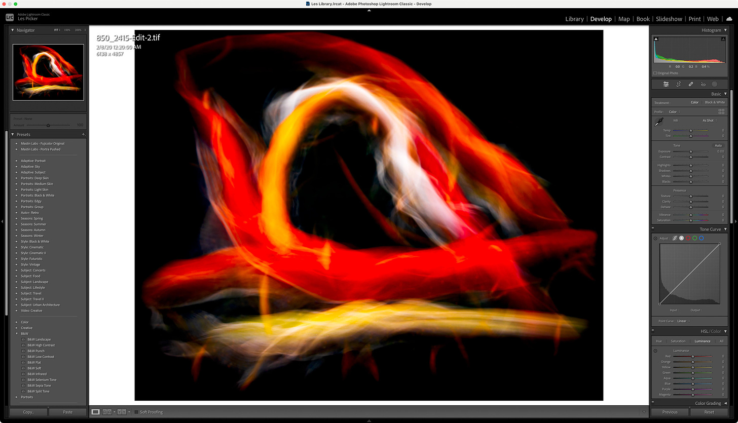
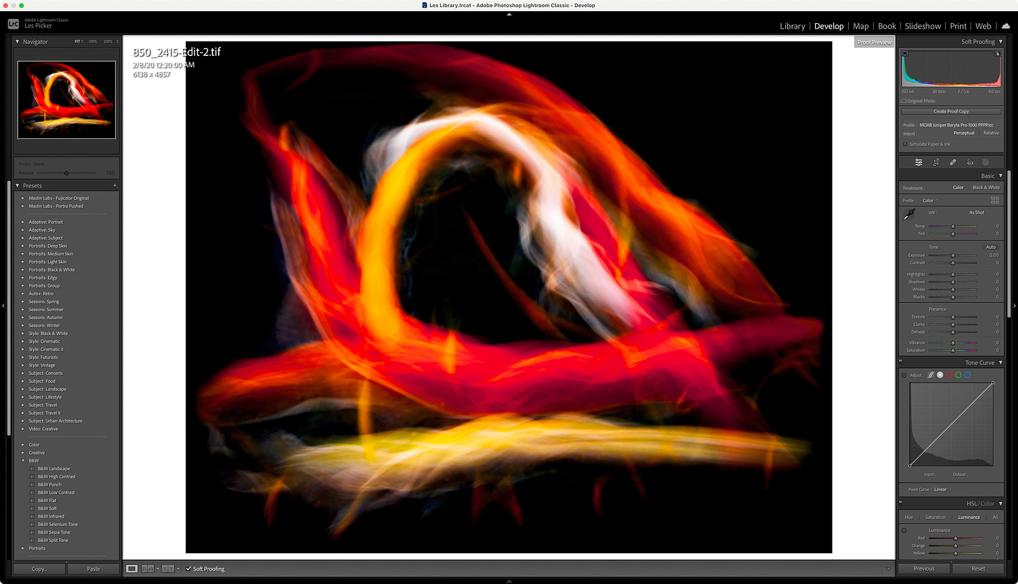
A great example came up in one of those workshops a couple of weeks ago. When soft-proofing a particular image, the color rendition of the brightest, most saturated reds and oranges in the picture were very different than when viewed without soft-proofing on the screen. The usual question that comes up in this situation is “Now what?…”

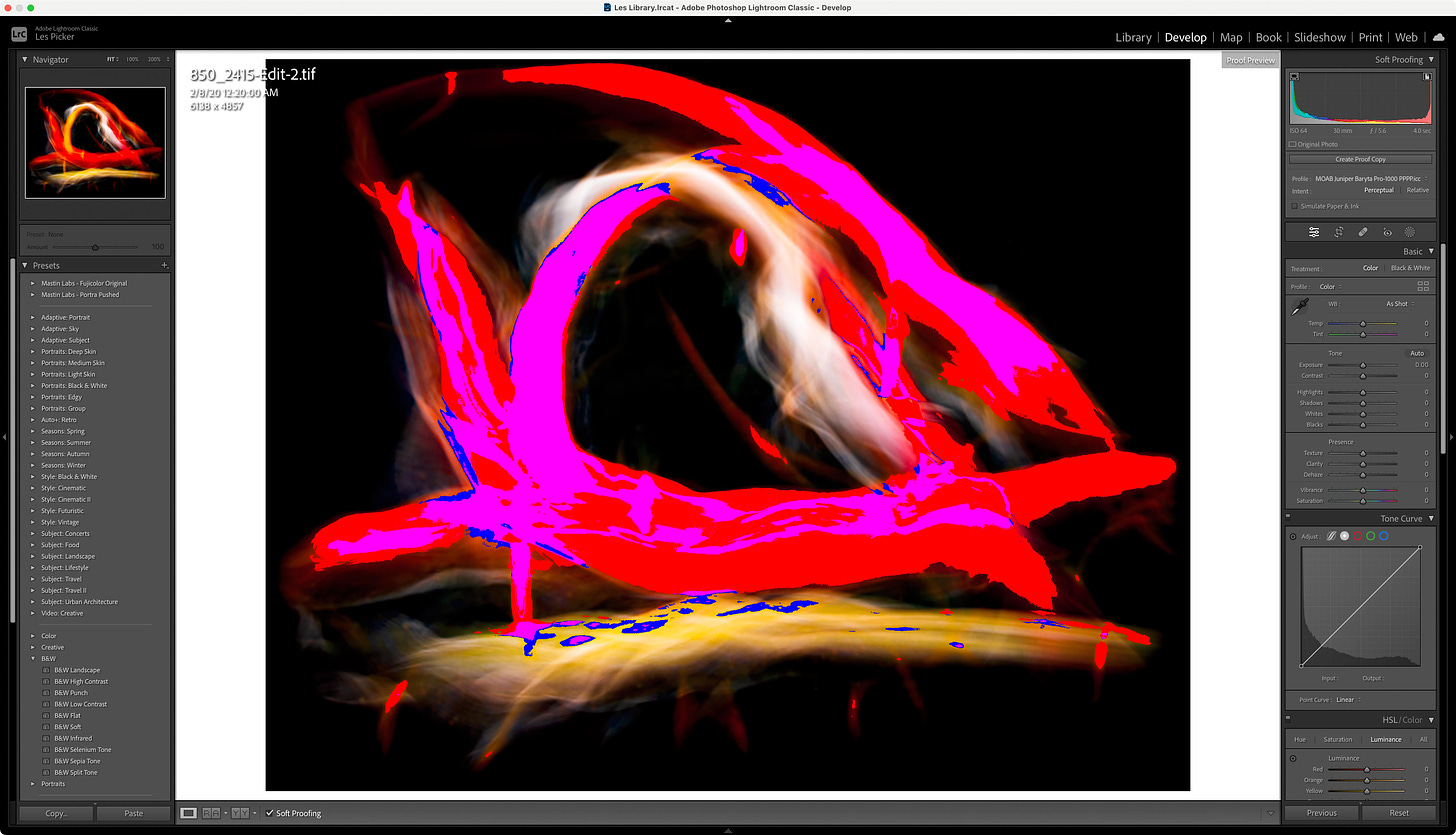
You can probably see the vast differences between the soft-proof and the screenshot at the top even though these screenshots are converted to sRGB. We were also looking at a small hard proof at the same time in the viewing booth. Soft-proofing did a perfect job of rendering those areas of the print the way it actually rendered on paper. So what does one do when the printer ink and paper cannot reproduce the colors that are in the image file and can be shown on an AdobeRGB monitor or for that matter just about any monitor?
Monitors are great at showing bright, vivid, super-saturated colors (especially in the red/orange/pink/magenta neighborhoods of the spectrum). Paper is relatively weaker for super bright, super-saturated colors. For this particular image or any other image that contains colors that cannot be rendered on the printer/ink/paper you are using the answer is not and cannot be; "make the printer do things it cannot". For some images, the answer may be to adjust all of the colors to render a print that shows the saturation of one hue vs another with more apparent contrast. In this case, the answer is to do nothing.
Let me explain in a bit more detail. The participant liked the hard-proof and had no specific concerns with the way the print looked. The areas that were rendered very differently had “better” and more subtle gradation in the closely related hues in the “problem areas”. Since one cannot make printers, paper, and ink magically produce colors they are incapable of the next question was something along the lines of “How do I make adjustments to the image so that there’s no difference in the soft-proof”. In other words, how does one reach a goal where there are no monitor or output gamut warnings when soft-proofing an image?
In this case, that’s not at all what is called for. I’ll go further that in most cases that’s not the point of soft-proofing. Theoretically, you could manipulate the image so that it happened to correspond to what soft-proofing shows but what’s the point beyond a futile technical exercise? Soft-proofing is showing you how the colors in the image file will be rendered in the print, it’s showing the adjustments that will be made by the rendering intent (in this case perceptual was far better than relative). Looking at it the other way around, the color management engine is making those adjustments for you and showing you what they look like, why would you want to manually do the same thing?
Of course, there are some photographs where your intervention will render a print that better represents your intentions. I believe there’s an example in the case studies section of the eBook referenced above. In most cases that’s not the case unless you have a commercial obligation to match a specific color identically.
The subject of color management does not have to be complicated. Unfortunately, it’s not easy to explain how it works or the best ways to use the tools at your disposal. Let your eyes be the guide rather than arbitrary technical criteria. Please ask for any clarifications in the comments as the vocabulary and understanding all of the technical aspects of the tools can be hard to discern exactly what any of them mean in a specific situation.


I have my work screen to have the same background as soft proofing. I also have the Gamut warning checked and the ICC profile for my lab for viewing. Everything there should be good to go. One thing I did was ask the lab for a test print to make sure that my images are what they see.