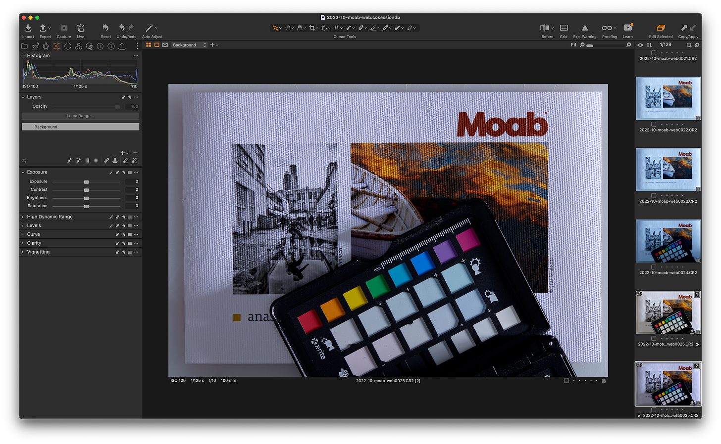
Way back in the last installment of Color Can Be Tricky, I discussed considerations when taking pictures. Specifically blown color channels, white balance, and its role in assessing images in the field. The image at the top is an example of the effect optical brightening agents (OBAs) have when making a picture of a print. I struggle with this all the time when making images of prints in the context of an environment or with other prints on differing papers.
I know that making pictures of prints is not a high priority for many printmakers. It can be when marketing prints for sale and related peripheral activities. I’ll address that some other time if anyone is interested. The reason I brought optical brightening agents up today is that it’s related to the broader topic of considering base tone when selecting a paper.
Let’s start with what OBAs do. Papers treated with OBAs absorb light in the ultraviolet spectrum and reemit them as blue light. The image at the top exaggerates this due to many factors. Those factors aren’t important for the discussion. What is important is that they will look blue rather than neutral. How blue papers appear will depend on the light they are shown in. Most viewers won’t notice it that much, they’re used to ”white” things looking bright blue. If a print with OBAs is displayed next to other prints without them it becomes quite obvious even in light with very little UV or blue spectrum as some OBA treatments are very strong. Mixed display of prints with and without OBA’s looks off. I’d recommend avoiding that when at all possible (take note exhibitors, curators, and organizers of group exhibitions — please).
In many of the print workshops I take part in the subject of pairing the “right” paper to an image comes up. Matt vs. Semigloss vs. glossy is the usual discussion. It gets much deeper than that with specific surface textures, whether the print will be behind glass, what kind of glass, and other mounting considerations. I’d propose that base tone is just as important and possibly more depending on the strength of the base tone.
Think Aesthetically
Now that I’ve satisfied the obligatory technical things I recommend when considering paper base tone you let go of all things technical and approach it purely from an aesthetic point of view. Paper selection and image pairing are an art. Fine art inkjet papers are expensive, treat selection as carefully as you do all the other factors that go into making your photograph.
Here are a few guidelines to consider:
When in doubt go with neutral, no OBAs. Eventually, you’ll thank me if you are addicted to bright paper.
Consider papers with OBAs as varying degrees of a cool base tone. Does the image benefit from some degree of a cooler rendition? What about the rest of the images that it will be displayed with?
Tread carefully choosing papers with a very obvious base color, usually very warm yellows, and browns. These take experimentation and experience but err on the side of less base tone. Does your image call out for a very warm feel? Before even making a proof print do yourself a favor and simulate the base color in Lightroom, Photoshop, or whatever software you use. It’s not hard to do. Even then err on the conservative side. There are certain images that scream for some of those gorgeous Hahnemühle, Awagami, and other brands' papers that are very definitely colored, let the image guide your decision rather than the paper.
Black and white images that have been “toned” digitally require special attention. Printing those on paper with an obvious base tone is probably a terrible idea. Printing them on a neutral or bright paper usually looks bad or best case “off” if any of the paper base shows. We’ve had to do that but printed the highlight color right on the base of the paper outside the image to simulate a paper with a warm base tone. The best case may be to get rid of the toning and use a paper that has a similar base color.
Keep these thoughts in mind as we’ve planned quite a few paper-paring essays in the queue. We also hope to have a guest offer his thoughts on OBA’s from a different perspective other than base tone so stay tuned.


Great article. It also takes time to get use to a particular paper and what its pros and cons are. Papers are also subject to change if the manufacturing process is changed or the sourced paper stock is different (Ilford Gold Fibre Silk is a good example as was Museo Silver Rag; two papers I used quite a bit some years ago). It is useful to standardize on a small number of papers that you know well and print on those. It's fun to experiment with new papers but you have to go through the profile making and do a lot of test printing.
Printing on today's papers is a lot different than when we printed b/w or on color paper. We just hoped we had black blacks or spot on color. It was where some of us could see point shifts less than 10 color points. Now it seems that there is a plethora of papers with base tones and print finishes to choose from. Is there a way to get a print sampling from a paper maker to see the broad spectrum? It would be nice to choose from the sampler the paper you would like to print your image on to. That way if you wanted something cooler or warmer, you would have the options in front of you. Great article, as we never consider OBA's