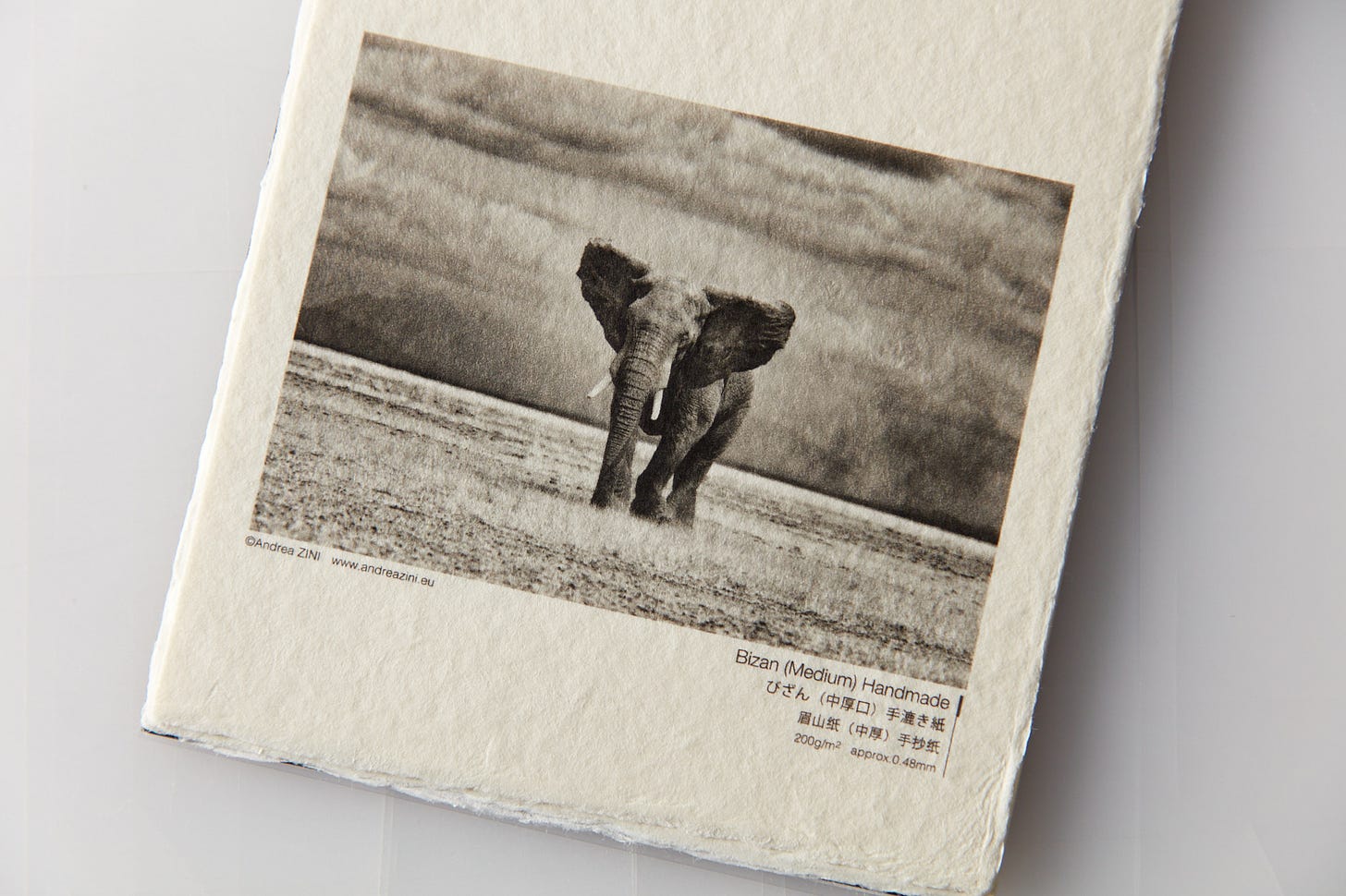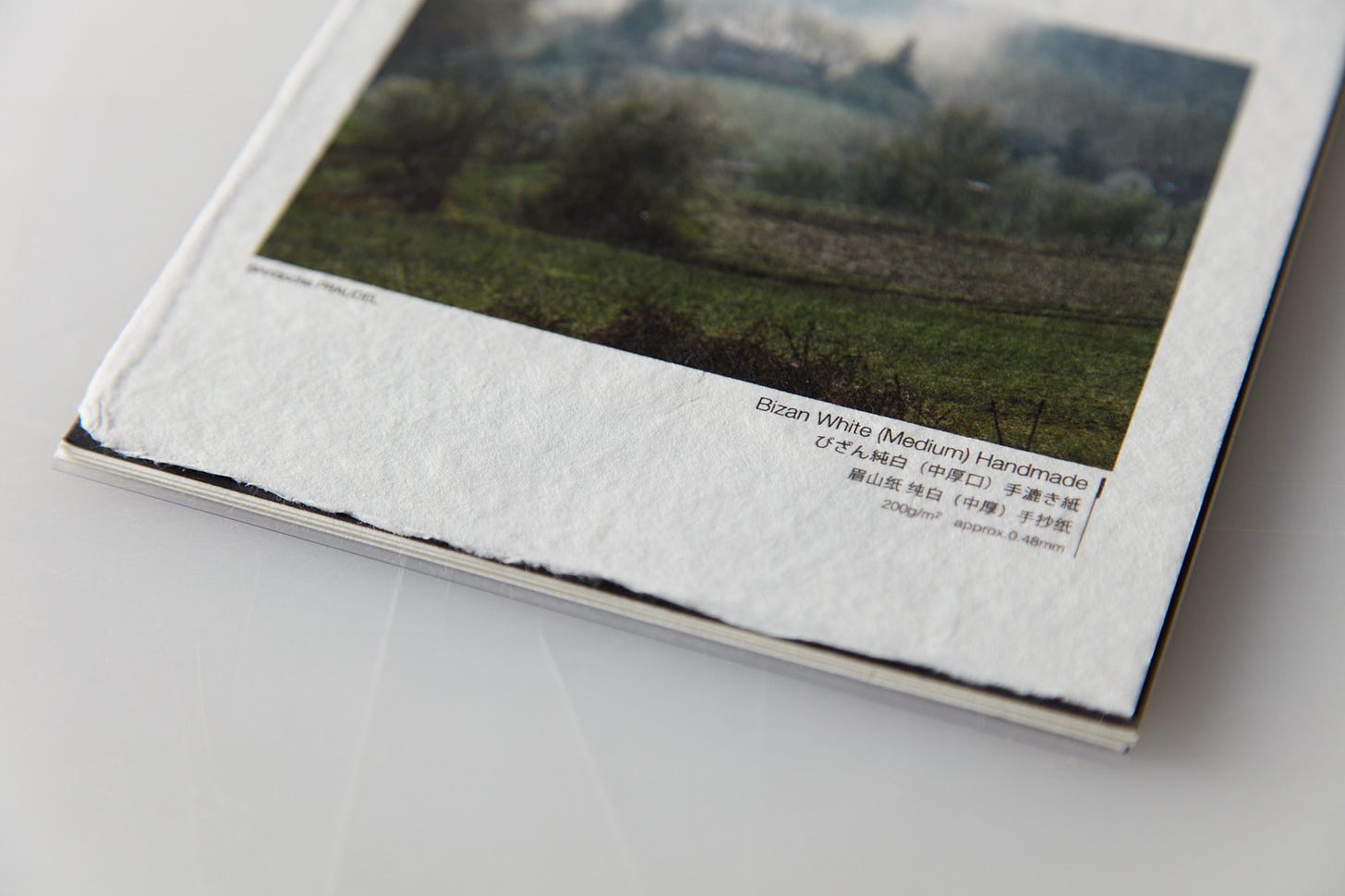
Today I wanted to summarize a few thoughts on making prints on paper with an obvious base color. For clarity, I do not mean the difference between neutral white papers as opposed to those with optical brighteners. I also don’t mean tiny differences in neutral white papers. The vast majority of papers used for photographic printing fall into those categories. I am talking about papers that are very obviously not white. Most of these papers are somewhat or very yellow/warm.
One manufacturer that comes to mind with a variety of these colored papers is Hahnemühle’s Natural Line. The other that comes to mind is Awagami. Almost all Awagami papers come in a ”natural and a white” variety. Make no mistake those “natural” varieties are not even close to neutral in terms of whiteness. All of them run the gamut from light to quite yellow/warm. The white types are more or less neutral without OBAs.
In our introductory workshops that use Awagami papers, we classify all of these yellow/warm papers as special purpose and don’t discuss their use broadly. Our general recommendation doesn’t mean we oppose their use or in some way recommend never to use these off-white papers or in general have any animosity towards image toning. Instead, we are putting all image toning in a special case or special effectclassification. A tool to be considered and used with great care.
Make no mistake, using a paper with an obvious base color is image toning. Yes, the ICC profiles you download or make yourself somewhat compensate for that tone but as ink density goes down that toning effect will be greater. Translation: from your lower midtowns through your highlights will be colored.
Practical Suggestions
So how does one decide if those colored papers would enhance a particular image or body of work? I gave a hint. Use one of a dozen methods in your post-processing software to introduce that toning into your image. You can evaluate it right on your screen. I assume most of you use Adobe Lightroom in which case you’d probably choose the color grading tool with a bias toward the mid-tones and highlights. You could use curves or a variety of other tools to do the same thing.
What’s even better you can proof that artificially toned image on a less expensive matte paper (most of these colored papers are matte and in many cases pricey). We regularly do this for our work before committing to an expensive special-purpose paper. The reality is we don’t even stock every size (or specific proofing sizes) of those specialty papers in our studio.
There are times we simulate those papers in terms of color. We don’t have ultra-large sizes (or they are not available)but need a very large exhibition print that has the same visual properties. In those cases that print isn’t going to be intimately viewed whereas other unique paper characteristics would be more apparent. We’ll use our go-to matte paper on a 44” roll and simulate the base color of the original smaller A2 print. It may take a couple of letter/A4-sized prints to nail that baseline but it’s not that hard.
One last bit of advice if using image toning to simulate one of these papers with an obvious color for display (or even proof purposes as it can make a difference in your perception) is to print that toning on the entire piece of paper rather than leave any white that will show when you display it. If you are printing color images that are toned you may be able to get away with it as we are all used to seeing many different color grading effects on color photographs in an otherwise neutral context.
When it comes to black and white images with either a simulated colored paper base they just look wrongwhen the image itself has colored highlights but is surrounded by paper that is white. You’ll probably need to use a tool like Photoshop to do that outside the image itself when simulating that warm/yellow paper base look.


.. so delights my eyes.. & relate this to ‘the medium is the message’..
or as he suggested to Aunt Martha over lunch.. ‘the massage..
.. & as a hypermedia artist have taken to heart.. ! 🏴☠️🦎