Les and I completed the latest installment of what has become our most popular workshop, Introduction To Fine Art Printing. It has evolved over the years but one thing has remained constant, discussions on what paper would be the ”correct” choice for any given photograph. The giant divide begins with the question; “matte or glossy”? Glossy means anything with some degree of shiny surface.
There are many photographs that surface choice might not have a huge emotional or visual impact either way. This assumes a similar rendering and post-processing treatment. Other photos seem to beg for one paper or the other whereas the opposite choice just seems to look wrong. Again, this assumes a particular post-processing treatment and image intent.
I bring this up because of the other coincidental discussion that is common; “How do I get my print to look like it does on-screen”? This is typically at the heart of the workshop and is a long answer but the bottom line is that you don’t. That question is similar to asking how to make matte paper look like glossy paper. Again, the answer is that you don’t. Digging a little deeper, those aren’t the questions to be answered. The real questions are what tweaks or adjustments are needed to optimize a particular rendering intent on a specific medium or paper.
Answering those questions and providing solutions are important. There’s something more important that happens when considering paper choice. In cases where a photograph screams for one paper or the other specific variations of a given matte or glossy paper come to mind. These variations then start to influence treatment decisions in post-processing that never occurred to you.
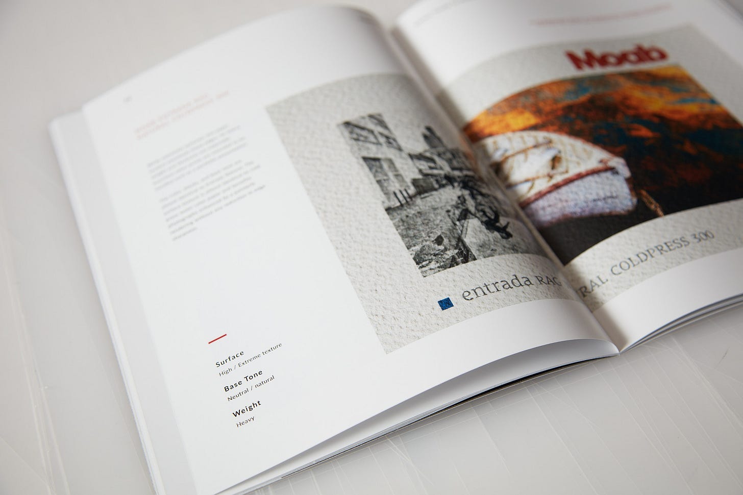
Case in point, a participant’s photograph that faded out to nearly white on the top and bottom. We proofed that image on Moab Entrada Natural. Upon examining the proof someone commented that it looked almost like a pencil drawing… That quickly developed into an idea to fade the sides of the photo in a similar way to the top and bottom. That followed quickly with an idea to print it on Entrada Coldpress. Coldpress ended up being the paper used for the final print. The point is that paper choice is not arbitrary and can inspire synergistic image treatments rather than merely problems to be overcome.
To reinforce this concept, the same happens with those “could go either way” photographs. Despite what might be an intuition that this would be an easy case of an arbitrary decision, sometimes these images require far more thought. There is the easy case where one paper easily shows a characteristic essential to the rendering intent. Typically there’s a paper characteristic that manifests itself as a defect to optimally rendering a photograph. In many cases, this would be perceived contrast and saturation.
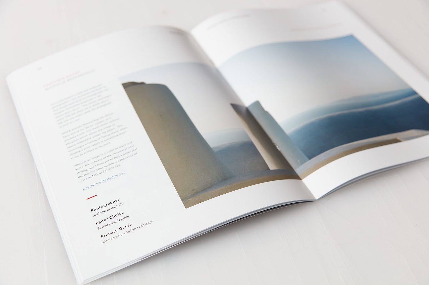
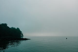
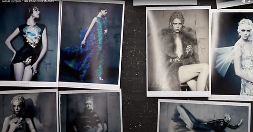
If the photograph and rendering intent is all about contrast, pop, and saturation then the glossy almost always wins. The interesting cases are when the “defect” suggests a completely different interpretation of the photograph. Less saturation and less contrast influence the decision to double down on those properties. Instead of trying to correct for less contrast and saturation, dialing back the saturation significantly makes for a far better rendering of the photographer’s intent and vision. This happens far more than you’d imagine. A fine example is at the top of the post. It’s sublime when rendered with subtle gradation, low saturation, and softer shadows printed on matte paper.
Producing prints of your artistic vision is not always a straight line. Be open to print materials influencing your choices. An image treatment is not always in the same direction as where you might have started.






Thanks for these comments. One of the difficulties is we have too many paper choices/brands. Nobody has the time to fully review and test all of them. Sometimes coating formulations change and the 'new' paper does not yield the same results.
I print on both matte and glossy papers with success that is highly dependent of the image. Soft proofing gets you so far but there are always nuances that are not revealed until you have a print to view. I have settled on four papers that I routinely use these days. I have had enough time with each to figure out all the idiosyncrasies.
Good point on coating formulations changing. I really enjoy testing as many papers as possible and have noticed that different batches of the same exact paper render different results. I find paper texture (or lack thereof) and color gamut to be 2 of the most significant factors that influence my choice of paper for any given image. While this does not alleviate the inconvenience of inconsistency in formulation, it does better enable me to find what I believe is the best choice.