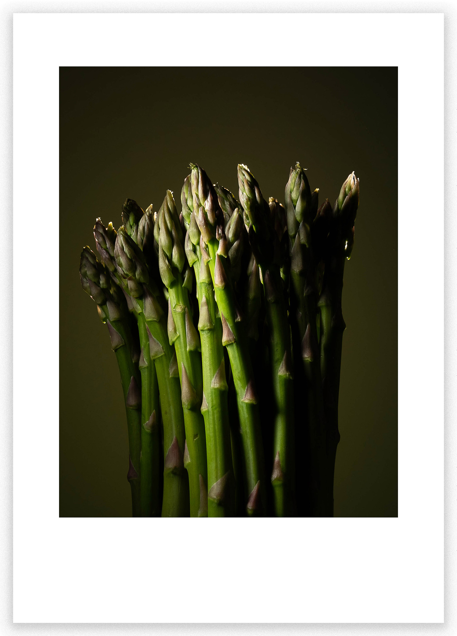
Please forgive our unplanned hiatus last week. A perfect storm of events thwarted efforts to publish a newsletter. Specifically, I was bedridden for four days with some horrible bug and Les was in the midst of traveling out of the continental US. We now resume our regular broadcasting schedule.
As I made pictures in my cramped, messy, low-ceilinged studio the other day, a familiar and long-standing sentiment crossed my mind; The ubiquitous 3:2 aspect ratio we’re saddled with. This somewhat queer aspect ratio of 1.5 is more common now than it was when we shot film. At least that’s the case for most of the serious cameras we use. Today we’ve two choices in terms of our capture medium. The first is 3:2 for every full-frame, APS-C, and exactly one medium format sensor (Leica S). The other is the even more ubiquitous 4:3 found in everyone’s pocket, the micro 43 cameras, and both baby as well as full-sized medium format cameras.
With few exceptions, I’ve always found 3:2 a fantastic aspect ratio for composing horizontally oriented pictures. Somehow it’s always felt about right. On the other hand, I’ve despised 3:2 for vertically oriented compositions. Almost every vertical picture ever seems so awkward in a 3:2 aspect ratio. That’s where 4:3 or 5:4 just seems right, so well-balanced, so natural.
You might be thinking “So what” with today’s EVFs and more than adequate resolution for cropping to any aspect ratio we desire. Problem solved, just set your fancy mirrorless camera to your preferred aspect ratio and compose blissfully in 3:2, 16:9, 4:3, 4:5, heck even 2:1 on one of my cameras. Sure, I guess so but as photographers we are confronted at every turn with things that just don’t fit. Take paper sizes, especially sheet paper sizes, they’re rarely in tune with our compositions. Sure we can cut them, matte them, and mount them in any way we desire. That’s always been true but again things get more complicated as we group those custom aspect ratio compositions together.
Photographer As Designer
As we assemble and curate groups of images to be seen together as a group were faced with not-so-easy decisions. We need to be cognizant of how those groupings look and hold together. One of those decisions is certainly the aspect ratio of the finished work. In an exhibition, you may get away with a couple of differing aspect ratios and orientations but ultimately the overall effect should be random.
In a portfolio of loose prints, the choice of paper size becomes universal for every print in the portfolio. That choice is now the same size and aspect ratio for every picture you include. What a mess if you cut each sheet to somehow match the aspect ratio of each image. The same is even more constraining when it comes to a book of any kind. Here you will be forced to decide on not only the aspect ratio of the book page but also the orientation no matter how the photograph is composed.
We photographers may not realize it but every time we make a physical manifestation of our pictures, we need to also be aware that we are designers. We are designers not just of what is contained within the photograph itself but also of the way that piece of paper we’re printing on looks, the relationship of the aspect ratio, orientation, and size of the picture on the page. I’d suggest that you spend some time playing with and experimenting with that aspect of design every time you print. Try things that aren’t so obvious, see how they work. Try different proportions of image to paper, differing amounts of white space, and its distribution.
The Lightroom print module is a god-send for playing around with paper sizes, white space, image size, placement, and aspect ratio. Start with the ”cell size” and set those dimensions accordingly for an attractive aspect ratio (in my case 4:3 for a vertical). You won’t even need to crop your original if you use zoom to fill, just drag your image around directly inside that pre-configured box. Play around with varying degrees of white space and placement. Heck, make your proofs an exercise in layout design. It doesn’t need to be complicated.
Many more thoughts as Les and I continue our book-making endeavors.


The Lr Print module is a good way to layout the image on the paper. I was just showing a colleague how to use the Cell Size and Margins to do this.
Vertical 3x2 never "feels" right to me.
For the first time I bought the roll of paper. It’s 17” x 75’. I only needed to cut the length. That was a little project but set it up on dining table and it worked. Cut 25 sheets and have some paper left. It fits into plastic sleeves from Blick to save till I print.