Make Things
On-demand printing, low-key photographs, exposure, etc.

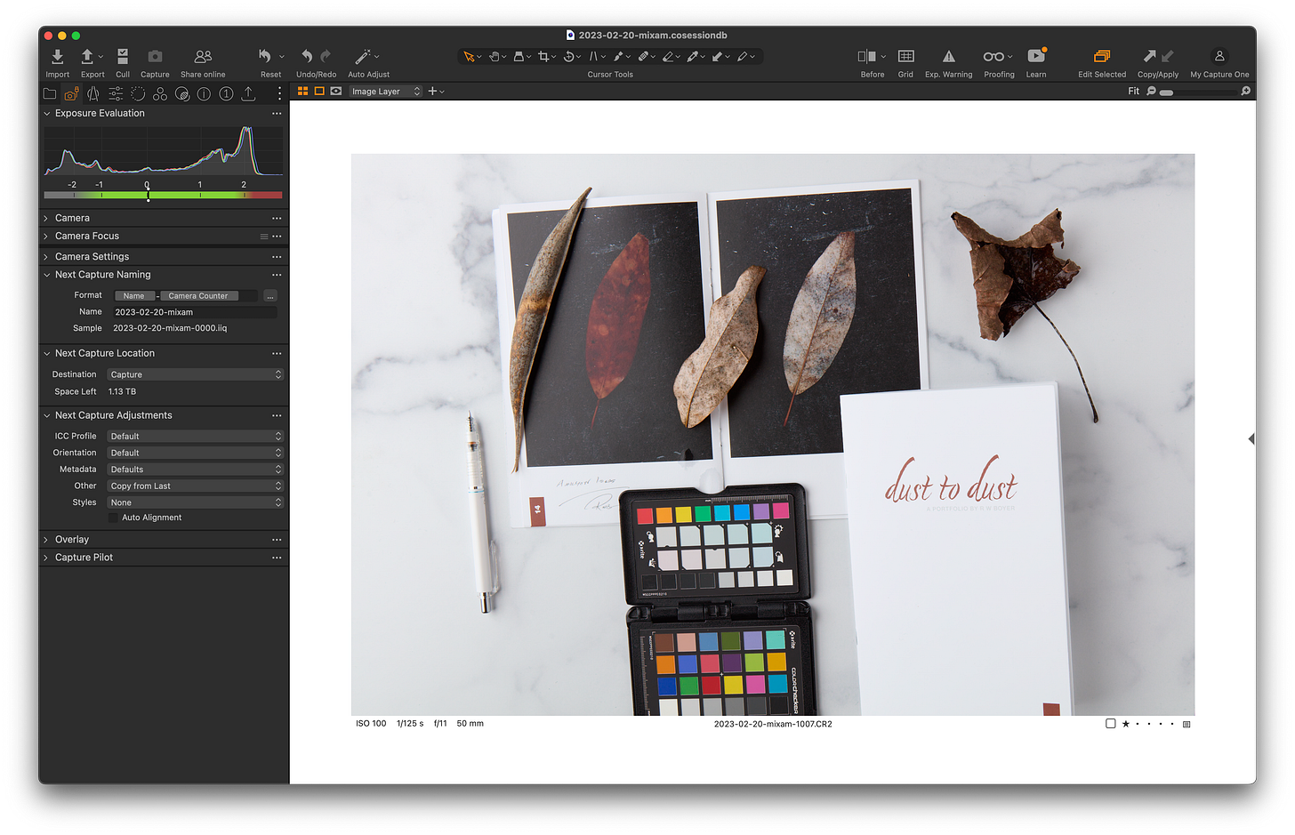
vA couple of weeks ago I wrote my lamentations of winter, how a couple of leaves inspired a tiny project, and how rewarding small-scale still-life photography can be. I’m following up with a few thoughts on making real things. One small spark of inspiration, a couple of hours making pictures, and a quick look on the computer to make my selects. All finished from start to finish in a few hours.
Was I done? Of course not, I printed my selects. I made one proof on my 4x6in Canon Selphy then sent those selects off to an on-demand printer. I could have sent them off to get a pack of small prints but I prefer little books. Not all projects need to be epic. Not all books need weeks or months of design and all the skills required to master tools like InDesign or Publisher. Simple, short, and sweet are fine. Many times simple, short, and sweet is better.
I happen to know how to use a few of those design and layout tools. It’s quicker and easier for me to chuck together a simple layout and upload the PDF to an on-demand publisher like Mixiam. There are a gaggle of on-demand printers that have various value propositions. A lot of them have premade layouts, just pick one and start dropping your photos in.
Most of these produce similar results. Some have high-end covers, some have different paper selections. Pick one and try it out. Don’t opt-in for a $200 book with a fancy cover on your first try. Try Adorama’s Printique or one of a dozen others with similar services. Don’t want a book, make some small prints yourself. I regularly cut larger sheets down (in half or quarters) after printing two or four-up on a page for something a bit bigger than 4x6 but smaller than A4. Lightroom’s print module is pretty handy for this as long as you have a decent paper cutter.
Experiment
That tiny project I titled ”dust to dust” was shot in a single session under controlled lighting with “correct” exposure. I did nothing but make selects, 18 of them to be exact. I used Capture One’s default tone curve (film standard) and my default color profile (ProStandard). I am extremely familiar with exposure and those particular defaults as well as how they generally render on a variety of print media. Some processes and paper selections have minor differences in how they separate deep shadow or extreme highlight but in the digital world there are not massive variations from my “standard”.
Knowing my baseline I have been eager to try a few things with the on-demand print service I use. They have an “uncoated matte” paper selection I’ve never tried. I wanted to see how that compares to our go-to fine-art matte paper. I also wanted this to be inexpensive so I tried the small digest size (exactly half letter size). I played with the paper weight options and it turned out that particular day that the heaviest paper options were the same price as the default weights. The heavy-weight paper was less expensive than the thinnest paper so I wanted to see what they were like.
Each book with 24 printable sides including the cover cost me $4 each. The cover was 120lb cover stock and 100lb interior pages. Cover stock is generally stiffer than interior pages even at the same weight. All of these selections turned out to be bad ideas, especially with the staple-bound option. I should have spent the extra dollar for perfect binding but even then the pages are way too stiff for such a small book with simple bindings. They will not close, they don’t open all the way, they are hard to turn pages individually, and if manhandled the cover is so stiff it immediately tears through the staples detaching itself.
The “Uncoated” Matte Paper
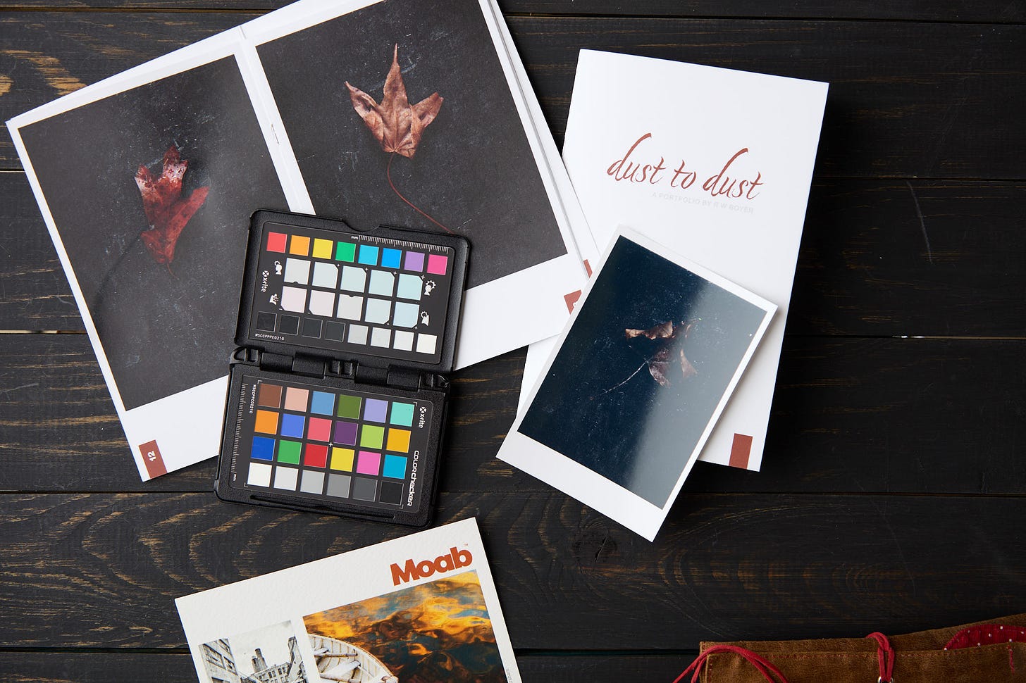
Any fantasy I had about the uncoated matte paper looking anywhere near what something like Moab Entrada printed on our Canon printers immediately vanished. I’ll admit this was a worst-case scenario by design. I quoted the word uncoated as I doubt that’s entirely true. It’s probably the smoothest matte paper I’ve ever touched and doesn’t bleed when written on with a liquid ink roller ball. That’s not in and of itself the huge difference between process printing and fine art mediums. The far bigger issue is the density laid down with the low-key images. That level of density reveals how shiny the actual “ink” is.

Here you can clearly see the sheen of that dense black background compared to a glossy print and a small Moab Entrada print. This would be much less noticeable with less ink lay-down for the overall image. Even so, any area of black will have a sheen rather than matte finish upon closer inspection. One other note is the paper is definitely “bright” as it has optical brightening agents rather than neutral. See compared to the base color of Entrada textured.
Is there an upside, did I learn anything useful? Absolutely, the heavy-weight matte paper has a much nicer feel than typical semi-gloss magazine paper. It has zero show-through. I can print on both sides. I can envision using this for a lot of things, just not bound books, and certainly not for low-key images. I was also shocked at how well the shadows separated. An added bonus is the ability to write on it with a pencil, a liquid ink pen, or just about anything else. Something I’ll be keeping in mind for future ideas.
I was expecting complete mud compared to a fine art paper. There’s no need to tweak the shadows any differently than I would using a fantastic matte paper with a pro inkjet printer and a good profile. The color correctness was top-notch, I already knew this from earlier tests but it seems to hold true across papers as well. You can probably expect this for any on-demand printer that specializes in photographic work. The equipment and practices are not completely different from one provider to the next. Don’t expect this kind of consistency from the lowest-price non-photo-oriented services such as Amazon KDP.
A Word About Low-Key Images

Dark things should be dark. Shadows within those dark things should be even darker. One doesn’t as a matter of course under expose to make low-key images. Conversely high-key images are not over exposed, they are composed mostly of light-toned or very light-toned things with not a lot of contrast between shadow and highlight, in other words not much lighting contrast.
I think a lot of photographers might be mislead by guidence that suggest that one under expose when shooting dark things and over expose when making pictures of white or very light toned subjects. This isn’t intended as a reference to under expose verses correct exposure, it’s intended to say that your camera meter could be giving you the wrong exposure based on reflected light readings.
I wanted to mention this about my reference to the “worst case” scenario for testing shadow separation. Assuming that you have dead accurate exposure for either scenario there might be a slight overall density/exposure adjustment in post-production when printing. Knowing your materials is the key. I generally know what Moab Entrada can do in terms of separation and rendering of deep dark tones. I would have added a third of a stop to every one of these images to get the print rendering I wanted (similar to my calibrated screen). I didn’t do that and got exactly what I would have expected on Entrada.
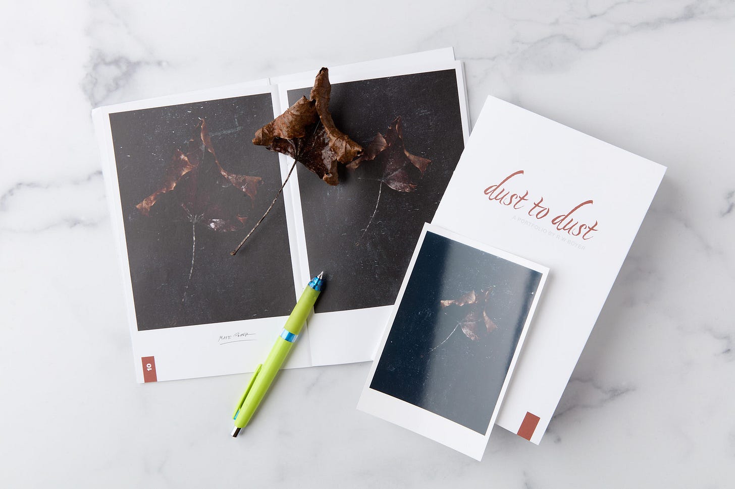
Above, you can see how dark that leaf is in far less contrasty lighting. Note how close real life is to the print rendering. The color is also remarkably similar and true to real life. The bigger obstacle in seeing how close the print is to the real leaf is that sheen. It’s compressing the darkest tones into the less dark tones merging them and reducing visual contrast between the two. In terms of color, the actual leaf changed in the time between the pictures. Not just this leaf, all of them except for that bean pod.
The bottom line is to play, make mistakes, and get to know your materials and your gear as well as you can. Every project, every time you make something contributes to your future endeavors in countless ways. This always works out better in the context of projects no matter how small when focused on “making things”.


Great article. I love the concept of short projects. My maxim for 2024 is to "create" in preference to "consume" and short projects are great for just exercising your creative muscles.