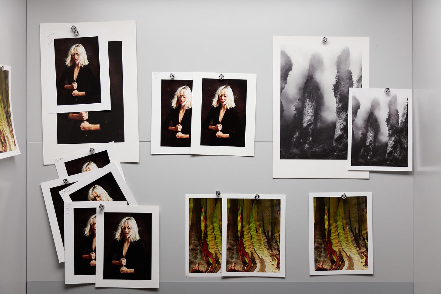
Our second installment comparing the communities favorite baryta papers based on the July survey. The title makes obvious the paper we evaluated against our workhorse baryta paper, Moab Juniper. Hahnemühle Fine Art Baryta was the most popular choice as indicated by that survey.
We have one more paper on the docket for evaluation, Red River Duro Baryta Fiber 300 or Big Bend Baryta 310. We’d love if the Red River fans that answered in the survey let us know which one to evaluate or any good reasons to take a look at both. Let us know in the comments.
Moab Juniper Vs Hahnemühle Fine Art Baryta
Running the risk of redundancy, we’re approaching the comparison for any notion of “better” between the two papers. Instead we want to provide a guide for those that may use any one of these papers in terms of what to expect from another. Of course, their will be preferences based on countless things including subject matter. I’ve included the detailed criteria we used for evaluation at the bottom for reference.
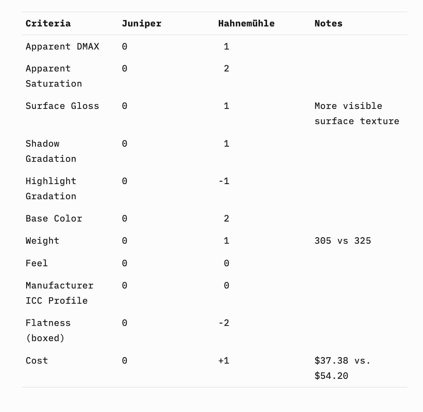
The Hahnemühle is the most expensive paper among those we are comparing. Unlike the difference in price between the Canson and Moab baryta papers, the price difference is significant. The biggest positive aspect in close comparison to Juniper is a slightly higher DMAX or blacker blacks. It also is far whiter than the other two baryta papers tested. When compared side by side, it almost looks like it has OBAs (Optical brighting agents). Hahnemühle doesn’t specify OBAs but does characterize it as “bright white”.
The combination of the slightly higher DMAX and bright white base might result in a perception of higher contrast in certain situations but the very glossy highly visible surface texture doesn’t manifest itself as obvious increases in contrast in all viewing conditions. This combination of DMAX and bright white base does give show a bit more saturation than Juniper.
Compared to Juniper it has the opposite characteristics than the Canson relative to highlight and shadow gradation. That is slightly more differentiation in the extreme shadows and slightly less differentiation in the highlights compared to Juniper. I’d imagine the surface gloss and texture are slightly impacting the highlight separation.
As always, if we missed something or there’s anything you’d like to know I didn’t cover, just ask. If you’ve observed differently than we have, please share. For the many Hahnemühle baryta fans out there, should we have compared a different baryta rather than the Fine Art? If so let us know why and we’ll definitely take it under consideration.
Evaluation Criteria
Since we’ve been using Moab Juniper for years all comparisons will be relative to that. We didn’t want to make these comparisons with a perspective of better or worse. Instead, the focus was toward qualitative characteristics that will allow those who use one of the papers (Moab Juniper or Canson Baryta Prestige II in this case) to get a sense of meaningful differences and how those would relate to your work.
We didn’t develop or perform technical metrics as those typically don’t translate to what a print will look like. Instead we developed a list of visual criteria that most of us would consider when critically viewing two otherwise identical prints side-by-side. We also threw in a few practical criteria when using the papers. Here’s the criteria we settled on:
Apparent DMAX (how black are the blacks)
Apparent saturation (typically this goes hand-in-hand with DMAX but there are exceptions)
Surface gloss
Shadow gradation (lower quarter of the histogram separation)
Highlight gradation (upper quarter of the histogram separation)
Base color (cooler or warmer relative to Moab Juniper)
Weight (the density/weight as well as the actual thickness)
Feel (somewhat subjective feel in the hand with a description)
Manufacturer ICC profile (how good or accurate is it)
Flatness (for cut sheets)
Cost (relative to Moab Juniper)
Any relevant notes for printers we discover that don’t nicely fit into a criteria
We decided to use a numbering system so at the end of this odyssey we’ll be able to publish a quick comparison guide that will point printers in the right direction based on what paper they are familiar with. That numbering system puts Moab Juniper at zero in every category. The paper we compare will get a score either less or more than 0 indicating the direction of variation from Juniper. We used minus 3 to plus 3 as the arbitrary values. A magnitude of 1 either way is a very small difference noticeable when comparing side-by-side on the same exact output file. The magnitude of 2 means a significant difference that’s very noticeable. A magnitude of 3 means night vs. day.
In the case of weight negative numbers will be thinner, positive numbers thicker. For base color negative will mean cooler and positive numbers, warmer. For feel we predict using only positive numbers with a note on the difference in how the papers feel. I guess there’s a possibility Les and I simultaneously exclaim YUK when touching a paper but I don’t anticipate that.


Because I've purchased and printed on Red River papers, I would very much like to see your comparison of both of the Baryta papers you have in mind. Thanks also for all of your comparisons - I've been happy to receive all of the emails you have sent and commend your efforts.
As you complete comparisons, it would be useful to add addition columns to show each paper compared to moab