Accept my apologies, this newsletter did not hit our target of Tuesday every week. Things got away from me this week as the unexpected collided with the committed. I am sure all of you have experienced that more than once.
My target of having this small project ”water colors” finished by the slightly loose deadline of Fall 2023 is upon me. Now comes the part that seems hardest of all. Defining what finished means in terms of exact physical output, committing my theoretical selects to paper, mounting, and finding a venue. There are a lot of things to do. Some of those tasks are just putting the work in, getting the materials in place, and dealing with inevitable problems that happen in the physical real world with printing and mounting.
Philosophical and creative problems still loom at the tail end of making the project real. The one I primarily wanted to discuss today I must decide but am still waffling over. I cannot go twenty-four hours without second-guessing what image will serve as the signature representative image of the entire project. Which one of my selects will I use as the most representative of the whole?
I’ve had a couple of candidates for quite a while. Having some idea of a signature representative of the project is a guiding light as you make additional work, go through the editorial process, and even when you start to produce the final completed physical reality. It goes further when you start to look for a venue to show the project and even promote that venue. That selection of a representative image would be the one you use in that promotion of a print show, the cover of a catalog, the cover of a book, and probably the first print anyone sees in an exhibition.
So, what is my dilemma? Why do I waffle? The answer is that I am not sure of how I lead potential viewers into the body of work that comprises this small project. That is always the question no matter what body of work you are deciding on the one cover image, the icon of the project, book, or exhibition.
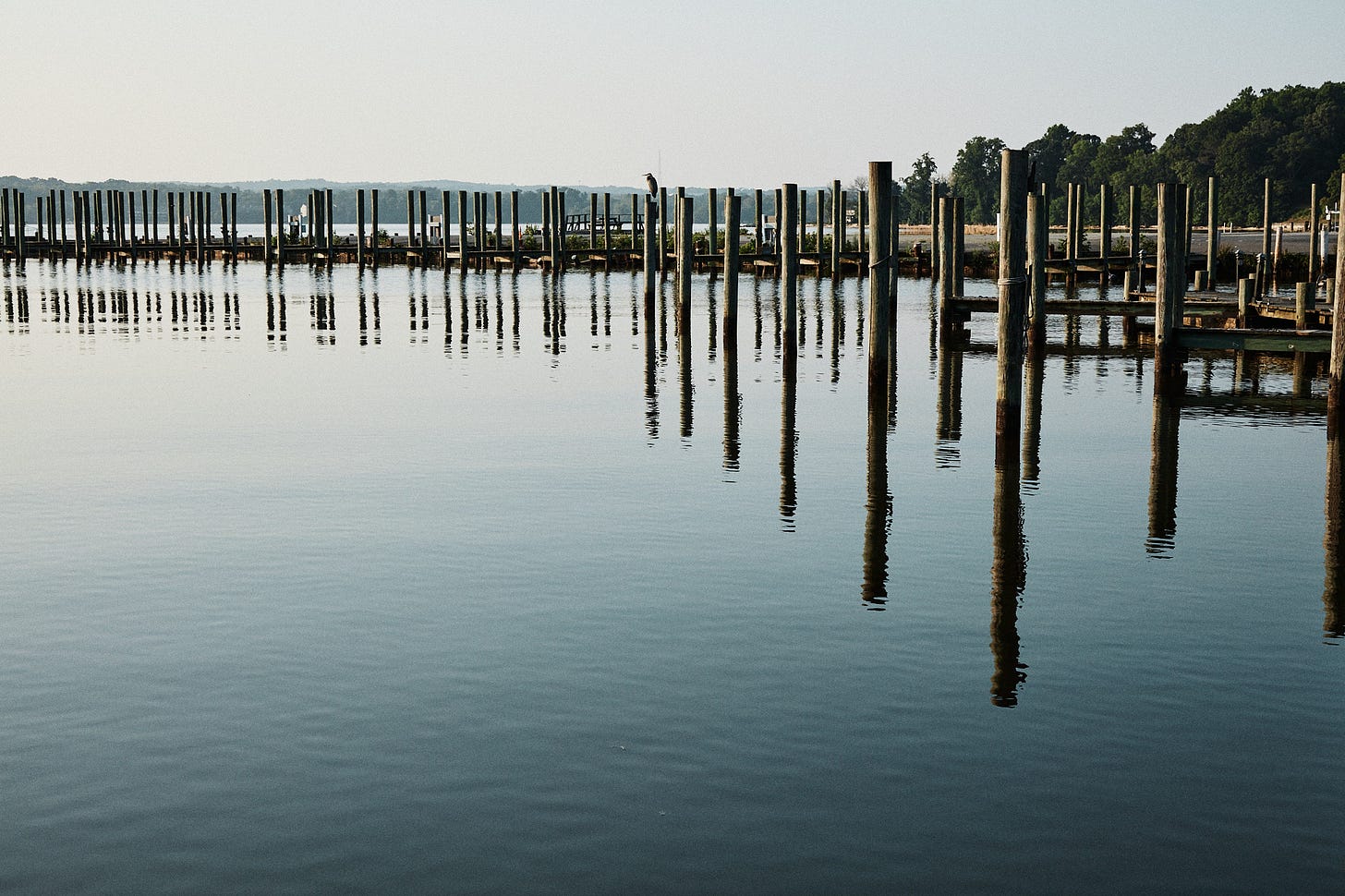
Getting down to the nitty gritty of my specific project the question is which end do I start with or do I start in the middle. I am talking about the nature of my project, not the actual subject matter depicted. The selects all have a common set of characteristics, specifically the blending of the abstract that meets the explicit reality of what is producing that abstract component. To explain that another way, every image includes the physical thing that is producing the abstract part of the rest of the image.
Most of the images in the project are a bit subversive as the largest part of the print is abstract, at first glance, they appear completely abstract but each one has at least a tiny bit of the object that is producing that abstract image. I varied the proportion of the real and the abstract throughout the project. This is what I meant when I said I was undecided on starting at one end or the other. Do I choose the image that has the closest to equal proportion of real and abstract or do I choose the one that has the least real and most abstract?
The current candidate at the top is the image with a nearly equal proportion of real and abstract, quite literally half and half but still represents all of the rest in terms of concept, color palette, aspect ratio, orientation, and subject matter. If I “start at this end” am I setting an expectation of the project as more of a landscape-oriented project of coastal landscape, specifically one that screams a specific geography? If I start at the other end with something that is almost purely abstract am I setting the expectation of purely abstract images? Either way, it would suggest I am subverting that expectation with the rest of the project. Is that okay?
Logic would say start in the middle to “avoid” subverting expectations wouldn’t it? For me, my temperament, and artistic motivations, that answer just will not fly. So that’s definitely not it. I have to choose which way I want to subvert the expectations of the rest of the project with either one end or the other in terms of abstraction. I am definitely leaning toward the image at the top, that half-and-half image. In terms of sequencing, do I then lead them down the path more and more into the totally abstract or do something else?
I think I’ll set myself a hard deadline of October 31st to choose which end I start with in the signature image for Water Colors. I have plenty of other work to do between now and then that has no dependency on that choice. The final paper selection, the mounting treatment, the final decision on image size (either A4 or A3+), and a bunch of related items. I will even start printing them as I only have to decide on the size after a few other calculations on the final presentation size.
Stay tuned, more to come in the coming weeks. Some of it will be about the materials, mounting, and print-related issues. Some of that will be about final editorial decisions.


Personally, I found the ruminating fascinating as these are new perspectives on displays to me. While I agree that ongoing self-argument on this is likely not productive, to me, on the outside, it's great to hear and follow the argument.
stop ruminating. Pick th image that you like. Give others the privilege of figuring out the rest. Let them have some skin in the game.