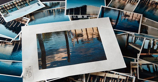
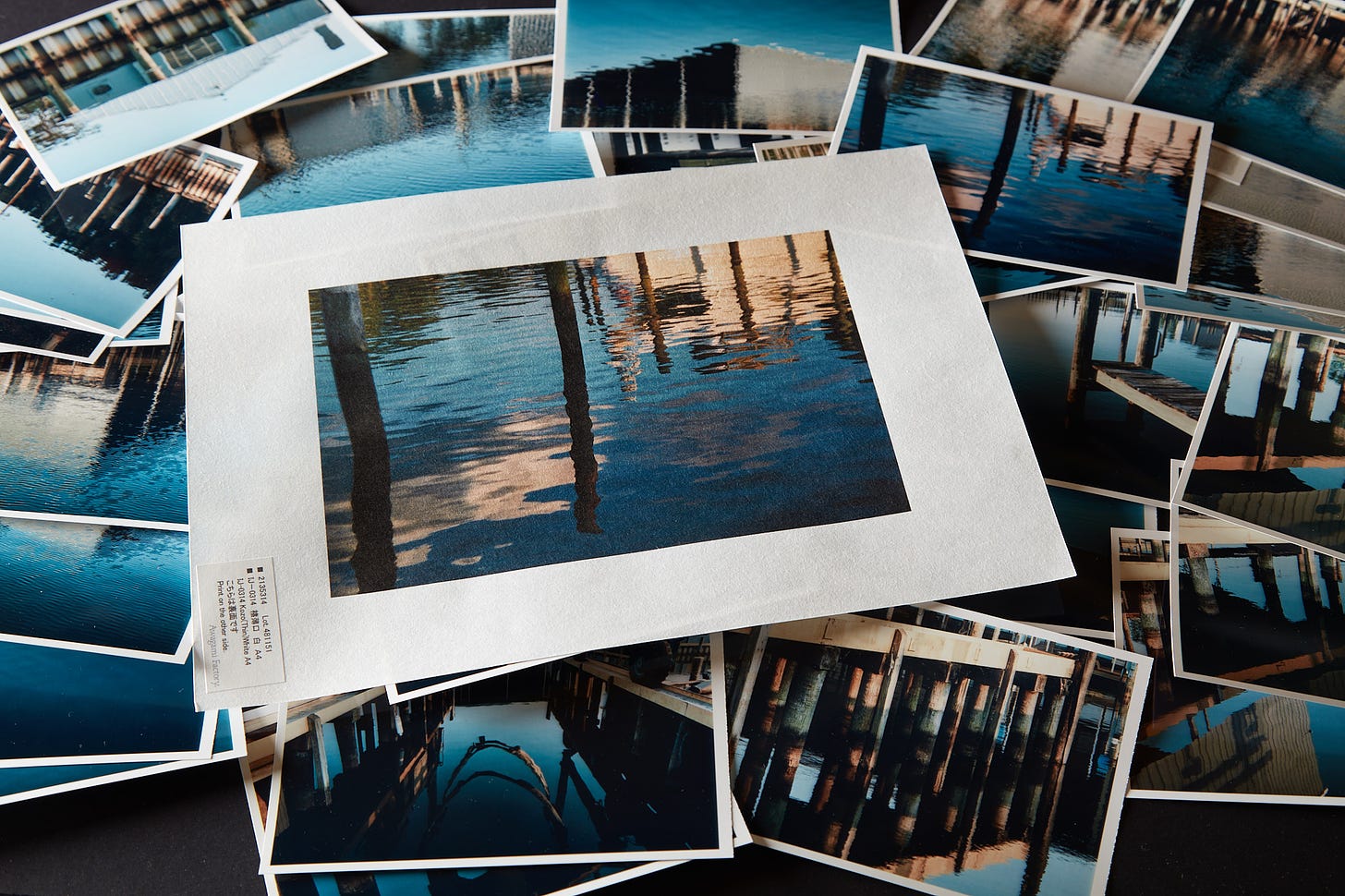
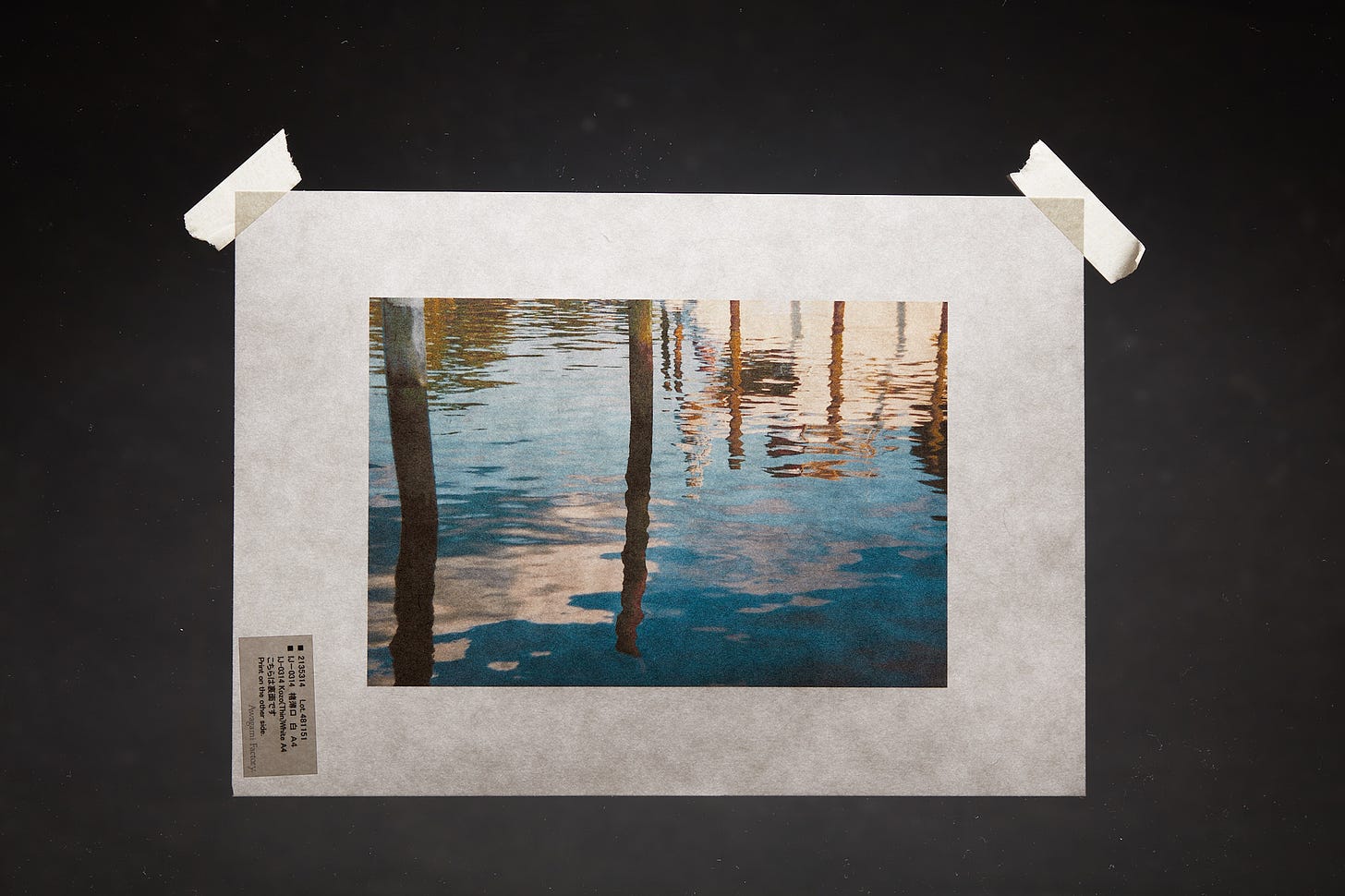
You may recall the photo above of Awagami Kozo Thin. It’s one of the top contenders I am considering for my Water Colors mini-project. I’ve not proofed any of the other thin varieties of Awagami yet but I intend to. In fact, I’m planning to proof all of those thin, translucent papers. There are quite a few varieties that vary in texture, internally visible fibers, and degrees of translucency.
I have a few years, and many prints experience on Unryu thin (55gsm). That particular paper is the most distinctive as its fibers are very large and very distinctive, so much so it can be tricky to pair attractively with images. All of that experience and all of those prints have been mounted in such a way that the translucency is not visible or in any way emphasized in the presentation.
Part of the allure of those thin Awagami papers is the translucency itself. In many ways it’s mesmerizing, at least it is to someone like me that’s easily amused by shiny objects. The simplest way to highlight that unique property is loose prints. The downside is that none of those thin papers, even the 70gsm Kozo thin, will hold up to handling a collection of loose prints. They’re frustratingly easy to damage. If not handled with extreme care they’ll look like garbage.
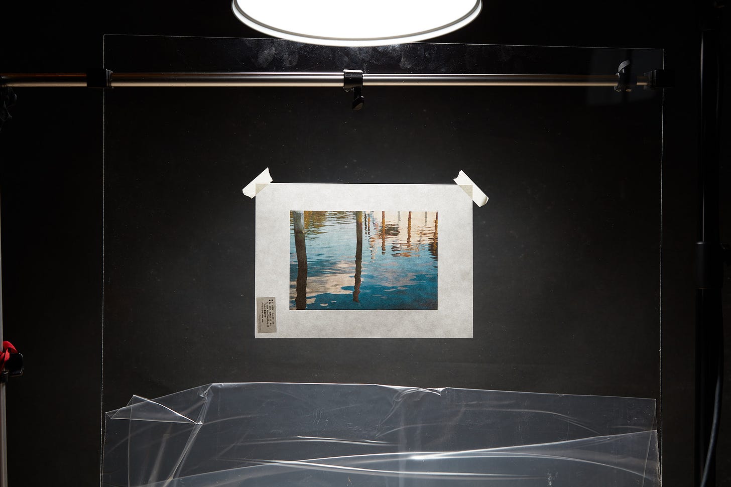
As part of the Water Colors project, I’m going to start experimenting with various ways of mounting the thin, delicate papers to specifically highlight their translucent nature as well as the gorgeous internal structure of the fibers that make them so different than other papers. Clearly, masking tape and a sheet of plexiglass are not in the running. The illustration above is a crude representation of what I was seeing in my cluttered still-life “studio” but it does demonstrate a characteristic that is key to the type of presentation I have in mind.

In a previous life, I have a lot of experience with translucent, backlit media. Typically commercially produced Duratrans and its modern equivalents. This stuff is very bright, and very eye-catching when displayed correctly. You see it all the time in advertising displays, that’s what it’s for. The correct way to display it is with very bright, very even light blasting through it. That’s why it’s eye-catching. If the light is uneven or dimmer than the ambient light this kind of material looks dull, lifeless, and downright lousy.
Conversely, the thin Awagami papers look great with varying degrees of light coming through the back of the print as well as reflecting off of the front. The characteristic I refer to above is the uneven backlight. What is not illustrated is any degree of front lighting that I was seeing when making this picture. What I saw was the almost even ambient light on the front of the print as well as the modeling light unevenly coming through the paper. What you see is only the flash coming through.
I could simulate that with another flash head here but I was too lazy and perfecting a product illustration was not my point. The real job here is starting to experiment with various, attractive methods of mounting the thin varieties of Awagami papers that subtly but explicitly show their translucent quality along with the nature of the materials used in making the paper.
Almost every exhibition space will have some sort of lighting that’s fairly close to where art is hung on the wall. Merely hanging Awagami prints from the ceiling a bit away from the wall with those lights slightly behind the print will be exactly what’s needed. Even a space with window light that reflects off light-colored walls behind a print will work. That’s what I was seeing with no lights on in the situation above. The only thing I need to do now is find attractive, practical ways of suspending the paper or mounting it with no backing.
Stay tuned in, I’ll be looking at “frameless” suspension ideas as well as various methods of sandwiching these thin papers in a “frame”. Some of those backless sandwiches may prove to be appropriate carriers for smaller prints that are meant to be handled as a collection. I’ll be sure to report back on any successes but also complete failures as those are far more valuable.
Another thing that I am considering is the interesting property shared by most of the Awagami papers, including the thin varieties is that they are coated and printable on both sides. In most cases, you’d not want to do that with the translucent thin papers as whatever is on the other side would show through. I’m thinking (maybe incorrectly) there may be a creative and attractive use of that “show through”. If you’re experimenting with this beware that the peel-apart Awagami (Kozo double layered & Murakumo Kozo) papers are probably not suitable for two-sided printing and would be a nightmare to run through the printer again without damage even if they were.


Two ideas.
What about using a reflective or bright material behind the print? A bit like slickrock (I've forgotten the name of the gorgeous discontinued photographic paper that has the reflective layer). Except have a separation between the print and the reflective / bright material. Like a shadow box. Mylar or a mirror might be too much.
With the idea of printing on the back - what about a solid color? R/C lexan bodies, are painted from the inside. So the first color is the primary one seen. Then subsequent layers subtly change the color. And then finally they put a fairly heavy layer of white, black, or gray as the final layer. It completely changes the look, and gives the color depth. Maybe experiment with different solid colors printed on the back of the paper?
Very much looking forward to following this adventure!