Detritus
A series of photographic prints by Joel Mark
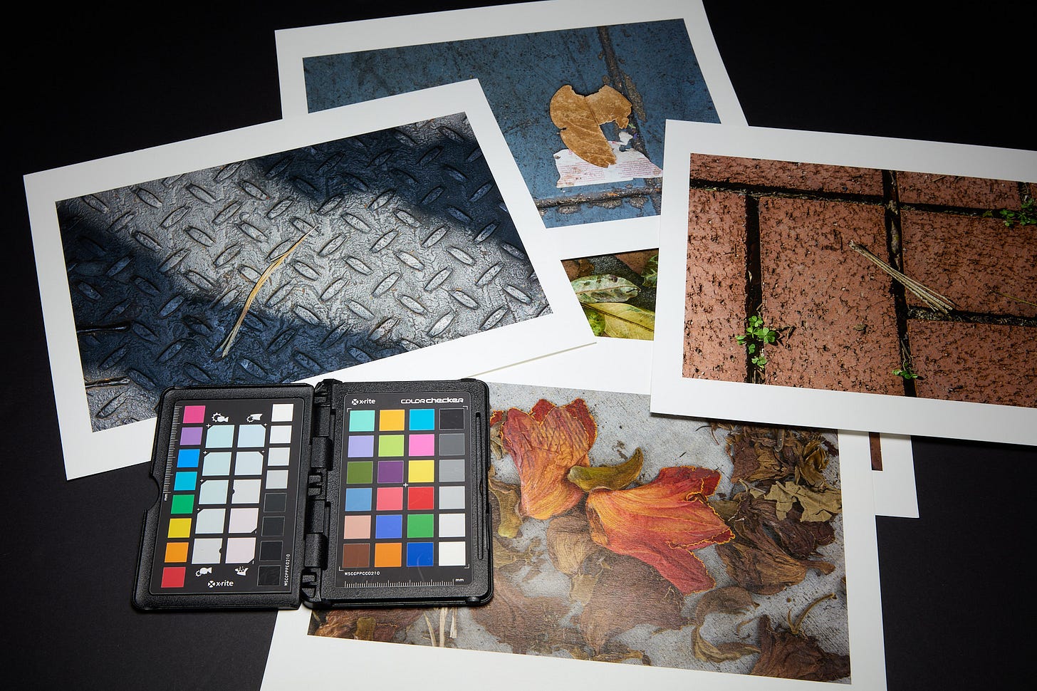
Many of us lament the day-to-day obstacles that impede the realization of our imagined perfect photographic circumstances. If only we had the time, funding, and ability to point our camera at subjects that somehow are always somewhere else we’d be doing great work. Right here, right now, right in front of us in our neighborhood - that’s not worthy of consideration. Here’s a reminder that those imaginary perfect locations, subjects, and scenes are not the reason we’re not doing great work.
Joel Mark’s Detritus project is proof that you don’t have to travel to faraway places with exotic scenery to make fantastic photographs and prints. The few prints that he submitted to the Paper Arts Collective 2021 exhibition are an example of great work that is far better exhibited together rather than a one-off print mixed in with other unrelated photographs. The series is a master class in composition, lighting, and use of color.
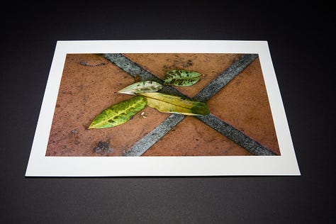
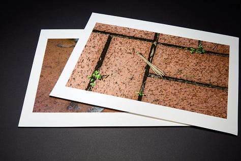
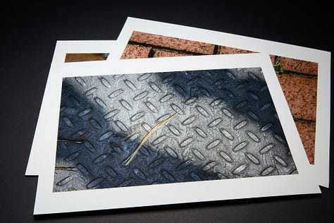
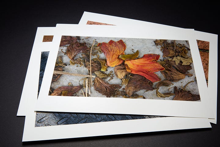
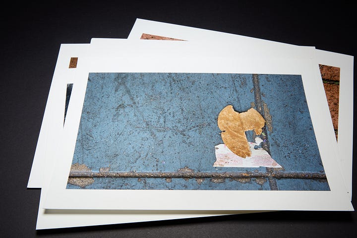
Joel didn’t send the entire series. Recognizing the beauty, harmony, and exquisite execution of the project only takes a few. Take a look at the entire body of work on Joel’s website. Curating an imaginary exhibition of any number of the collection from two to twenty is a delight. There are dozens of connective visual and thematic threads in the series. Color harmonies or discords, textures that are unified or contrasting, one could produce a dozen different but related collections.
No surprise, Joel has been a successful commercial and editorial photographer for decades in a very competitive market. Recently he’s been venturing farther into personal work and fine art photography. The series didn’t spring fully formed while dreaming about faraway subjects, fantastic situations, or landscapes to be photographed some other day. This series was born from going out and making work right outside Joel’s door. It came from keeping an open mind and open eyes, looking at the beauty of the world around him. This is what photographers do and should serve to both inspire and remind us all to go out and do the work. That simple act will lead us to new ideas, new directions, and ultimately new ways of seeing the world we live in every day.
Technical Aside
I know some of you are curious and possibly even benefit from a few technical details. For those that don’t read any further. I’ll include a few regarding the illustrations contained within to provide some insight into a meager attempt at conveying what these small 8.5 x 11-inch prints look like. I would love to see Joel’s project as an exhibition properly mounted and displayed.
Equipment used for the illustrations:
X-Rite ColorChecker Passport (now Calibrite)
Ancient Sekonic flash meter
Capture One 22 (yes I am a version behind as I use old cameras and am protesting the new pricing/upgrade model)
Why
I tend to approach everything as a portrait photographer. I tend to have and use gear that tends toward portrait use and know those characteristics. The only difference here I’d probably do anything different if a person was in front of the camera is that I took every reasonable degree to show you the actual, real colors of the print within the constraints of the sRGB color space. My Broncolor heads/packs (as well as some of my Profoto gear) tend to give me full daylight spectrum color rendering with great consistency.
The 5DsR using Capture One’s “Pro Standard” color profile and calibration gets me to color accuracy within a nanometer and no fuss and a hair towards Hasselblad/Phocus rendering (not exactly true with some other RAW processors and that sensor). I have zero need for high ISO in cases where my intent is zero noise/immense detail and clarity. When shooting in adverse/low light environments I tend to be fine with “noise” and usually add more noise to give a sense of the lower light and ambiance of the environment.
Joel printed these small prints on a paper very similar to Juniper Baryta (possibly Juniper) with a subtle soft gloss and texture. Large, silver reflectors with a distinctive hot spot and fall-off pattern are always my go-to light when I want to subtly highlight and show surface texture. The Mola Rayo is a dream for those who want a lot of control of where and how surface texture is rendered and want a distinctive, controllable fall-off pattern anywhere under 20ft away. Yes, it is that distinctive and therefore very versatile in terms of using its center hotspot with a distinctive, differing character out to its edge. This is NOT a reflector for those that want to “set it and forget it”.
#paperarts

