Design Vs. Economy
A short conversation about the importance of design in photography


Today I wanted to share a few thoughts on the importance of design when presenting your work. We just finished the latest installment of our Portfolio Workshop. It occurred to me how much of that editorial workshop is focused on design. The editorial process is inherently linked to design when making decisions specific to the physical presentation of the selected work. The impact of design decisions and how those evolve contributes more than one might think to the final product. In most cases the images selected influence design and design also influence the images ultimately selected.
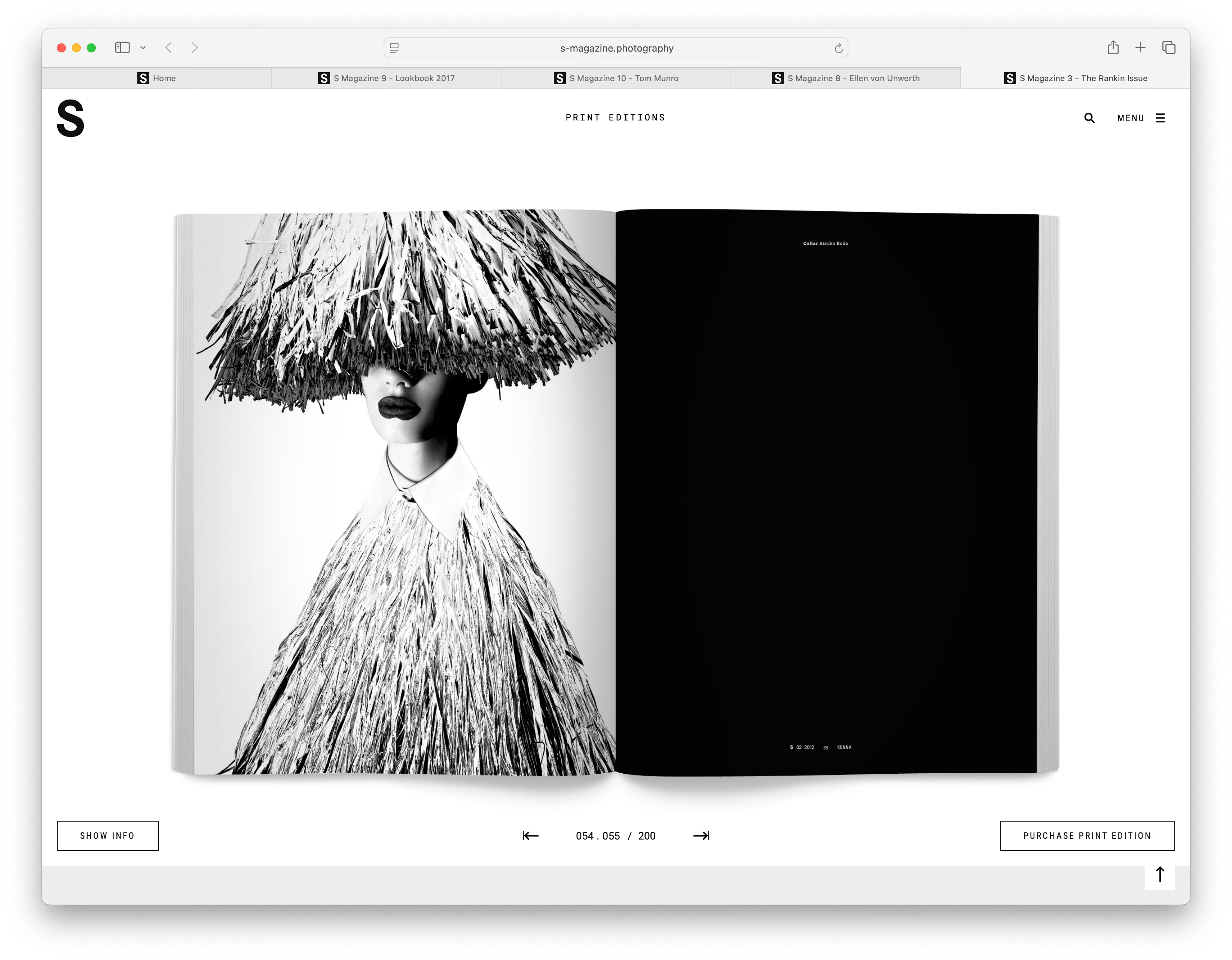
For the sake of this discussion I’ve included a few screenshots of Leica’s S Magazine. That choice was merely due to my recollection of how almost every collection of images shown in that publication has its own design language. Moving through a copy feels like completely different publications for each body of work presented. Take a look at that first spread. It’s obvious that the image selected as the first image seen influenced that title page in a huge way. You might ask yourself if the title was selected before or after the initial photograph was. Certainly that graphic “logo” representing the collection was after the initial image. What about the decision to contrast the high-key photography with a negative title page… it’s quite obvious that was intentional. There’s a good chance the opposite was also tried, a harmonization with white background and black logo and typeface. Let’s take a look at what happens when the page is turned.
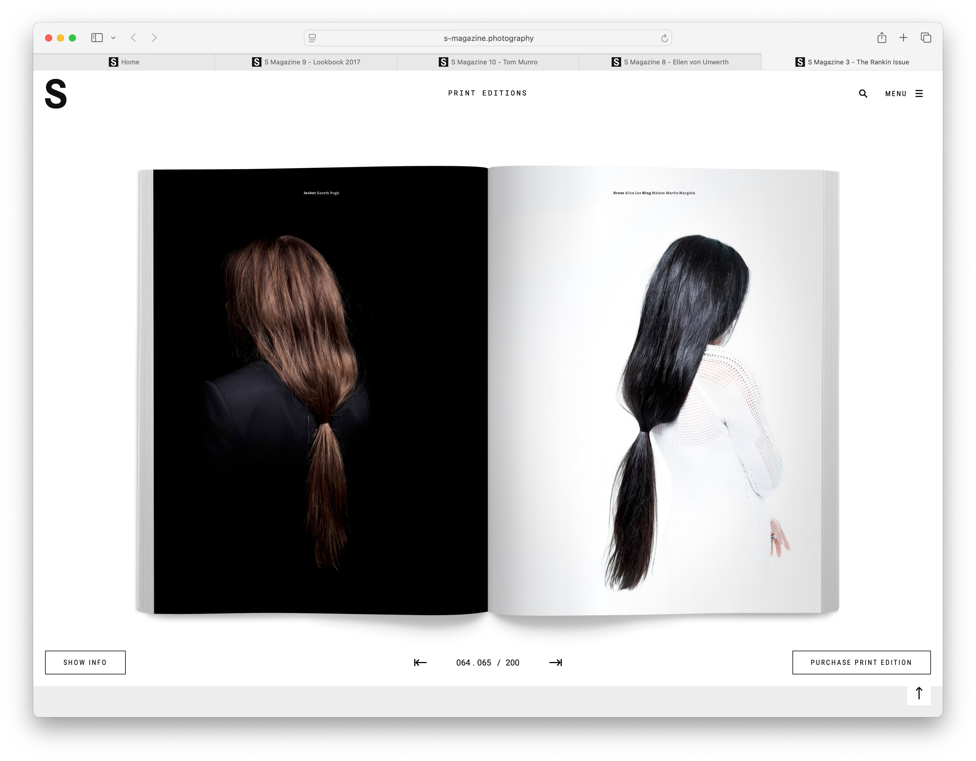
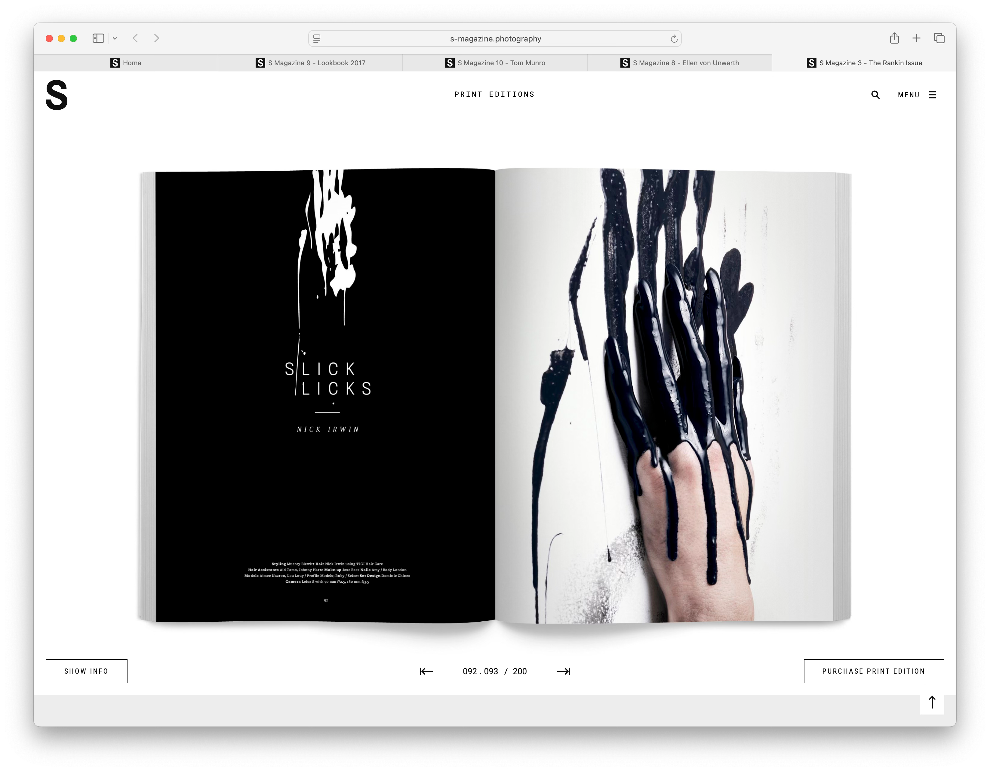
Wow, this spread and image pairing was a great decision. Do you think the design decisions of the previous spread were influenced by the pairing of these two photographs or the other way around? Was one of these images initially a reject but then included based on how the design evolved? Let’s turn the page again and see what’s next…
Another bold decision and certainly not an accident. It’s also an extremely inefficient decision. Inefficient in the sense of “wasting a page”. The more interesting choice was the decision to break the rhythm that was established so far. Instead of black/white, black/white, this spread reverses that to white/black. I am absolutely sure the opposite black/white pattern was considered with the blank black page on the left with the high-key white image on the right.
It doesn’t matter if you gravitate to this kind of photographic work or not, there is much to be learned in terms of design when looking at how photographs are presented and seeing what design decisions where made. Which ones were poor, which ones were great. This is obviously important in a book or magazine but what might not be so obvious is how important this is when the collection of photographs is a portfolio of loose prints or an exhibition. It’s super important and that’s where the conversation turns to design as opposed to efficiency.
Those two factors are in conflict more than you might expect. Let’s take the Portfolio Workshop as an example. For the workshop’s sake we put a hard limit of ten prints to be included in the finished portfolio. It’s a good discipline to have a target like that for many reasons. Of course we would allow eleven but we make it clear a case needs to be made to fellow participants of why that is absolutely necessary. In most cases there’s a combination of horizontally oriented photographs and vertically oriented photographs as candidates to be included in the final selection. There’s always the temptation to print two vertical images on one page in a portfolio of mostly horizontal images. That’s a great idea right? Why not fill up the page if the space is there?
Diptychs are great, as long as those two images say something together. If they don’t one image is better. What about printing that vertical so it takes up the whole page so the viewer has to turn it around. That’s a great idea right? Who needs all that white space? Wrong, it looks horrible in the context of the design language chosen for the rest of the photographs. This notion of design extends to the walls of an exhibition space as well. Sure fill up the walls, use up all the space, jamb images wherever they will fit. Of course when put in that language it sounds like a poor decision but that’s the temptation. If there’s space on a wall for another print but there’s not a good reason the images should be juxtaposed it might be better just to be less efficient with the space.
Design evolves throughout a project’s lifetime. Rarely are photographs selected entirely based on a pre-conceived design idea that’s completely thought out. On the other hand the collection of photographs tends to influence design of the presentation. The two inform each other and evolve together in that most difficult part of any presentation of a set of related photographs.
Great post. I’ve principally worked in academic science during my adult life, doing a bunch of scientific imaging there, but have also trained in graphic design. I follow along here because of the strong sense of understanding communicated herein. Great example of that here.
I’ll say this though, not that it contrasts anything said here, just that it’s a trap I’ve seen many fall into. Theory is just a conjecture we use to explain things that are empirically so. It’s not doctrine. Something isn’t good because it conforms to some theory. There’s no causation there. Any theory we have about why we think of something as being good is really just a guess that’s somewhat robust to critique, but it’s not like we have great, mechanistic theories in Gestalt psychology. So, I suggest people trust their judgement first, however they get to a given layout (and sure, use these theories as guides). The real key is to be critical. In this domain, it’s always comparative. There’s no right and wrong.
Design is important because the human brain seeks order, balance, and visual appeal; well-crafted images are more engaging, memorable, and emotionally impactful. These timeless principles, borrowed from art and graphic design, apply across all genres — from landscapes and portraits to street and abstract photography.