The term composition comes up a lot when discussing photography. The problem with that particular term is that it’s so all-encompassing. On one hand, the term can consume every single element that could possibly be discussed about any photograph. On the other, it can be far too reductionist such as onlydiscussing some arbitrary *rule of thirds or golden section, or one of a myriad other tiny little elements contained in a photograph with no context of the picture as a whole.
Composition is in fact all-encompassing. It starts the moment you point the camera at any subject. Truthfully composition starts even before that, when you choose a lens, it starts when you walk towards or away from any scene. Composition encompasses everything from lighting, to framing, and just as important as anything else, the moment you release the shutter. Sure, depending on the scene in question some of the plethora of those countless things are more meaningful than others.
I suggest you consider the all-encompassing nature of composition in any discussion or thought process of composition when selecting photographs you’ll end up using. More importantly, keep that in mind when modifying those photographs. In [every one of LPFA workshops]](https://lesterpickerphoto.com/types/workshop/) we spend a lot of time discussing, ”what is this picture about, what is the story”, prior to doing any post-processing. This is the where discussion of composition begins and ends.
It’s a big mistake in many cases to start with micro aspects of elements in the frame outside of context. This is one of the reasons I don’t like catchall terms when discussing micro elements such as “that thing is a distraction” whatever that thing happens to be. The distracting thing just might be important context or part of the story. The problem with starting with those micro elements is that it unconciously turns every photograph into some sort of insane product advertisement with just one element on a featureless background. I may be overstating that but I am not overstating that the discussion then trends towards that end. The making of a pristine one element photograph one “distracting element” after another.
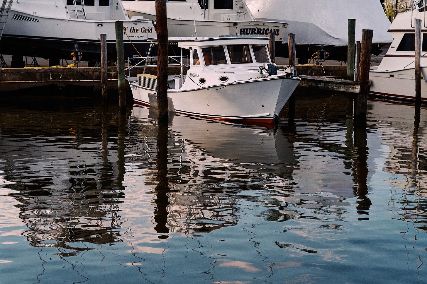
This can happen even when composing a photograph in the camera. Case in point; the photograph at the top of the post. Nothing super special, just part of an ongoing project photographic my own backyard. On this particular occasion I took my Fuji X Pro2 with an ancient Leica 50mm lens mounted to the front. This of course gives me a 75mm framing equivilent. I’ve never been comfortable with this angle of view, probably due to my lack of experience combined with the preference of a less compressed perspective.
My own personal pet peeve when framing things are awkward intersections of “stuff”. You know, trees growing out of things, etc. In my local environment it can be extremely difficult to manage those. Longer focal lengths can certainly crop scenes more effectively but also make any sort of “scene” more difficult to manage intersections for two reasons. First being that increased compression of backgrounds plastering layers together. The second is you have to move the camera a lot more to change perspective in order to manipulate those intersections.
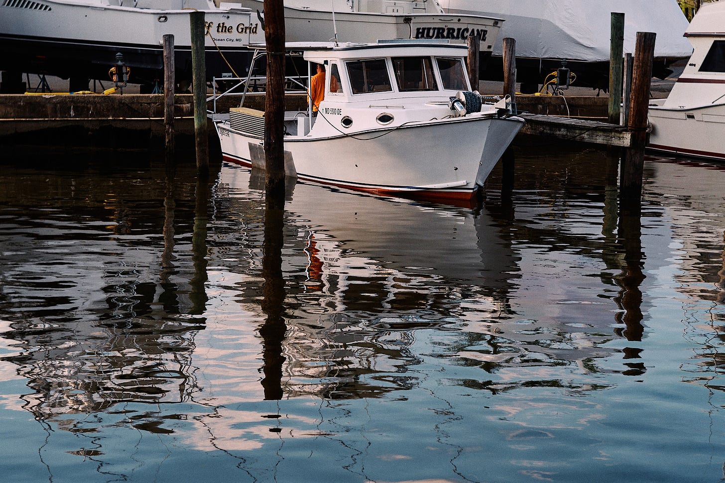
I was struggling with this particular scene and the light was changing fast. As usual the pilings were not behaving the way I’d like them to. The shot at the top of the post as you can see from the uncropped version proved to be impossible to frame the way I wanted to. I really wanted to be closer but my toes were already hanging off the dock where I stood. I cropped it due to the awkward intersection of the edge of the frame and the nasty almost intersection of the window frame in the distant boat’s relationship to that piling. I got the rest of them about where I wanted including the top edges of pilings with stuff in the backgroud.

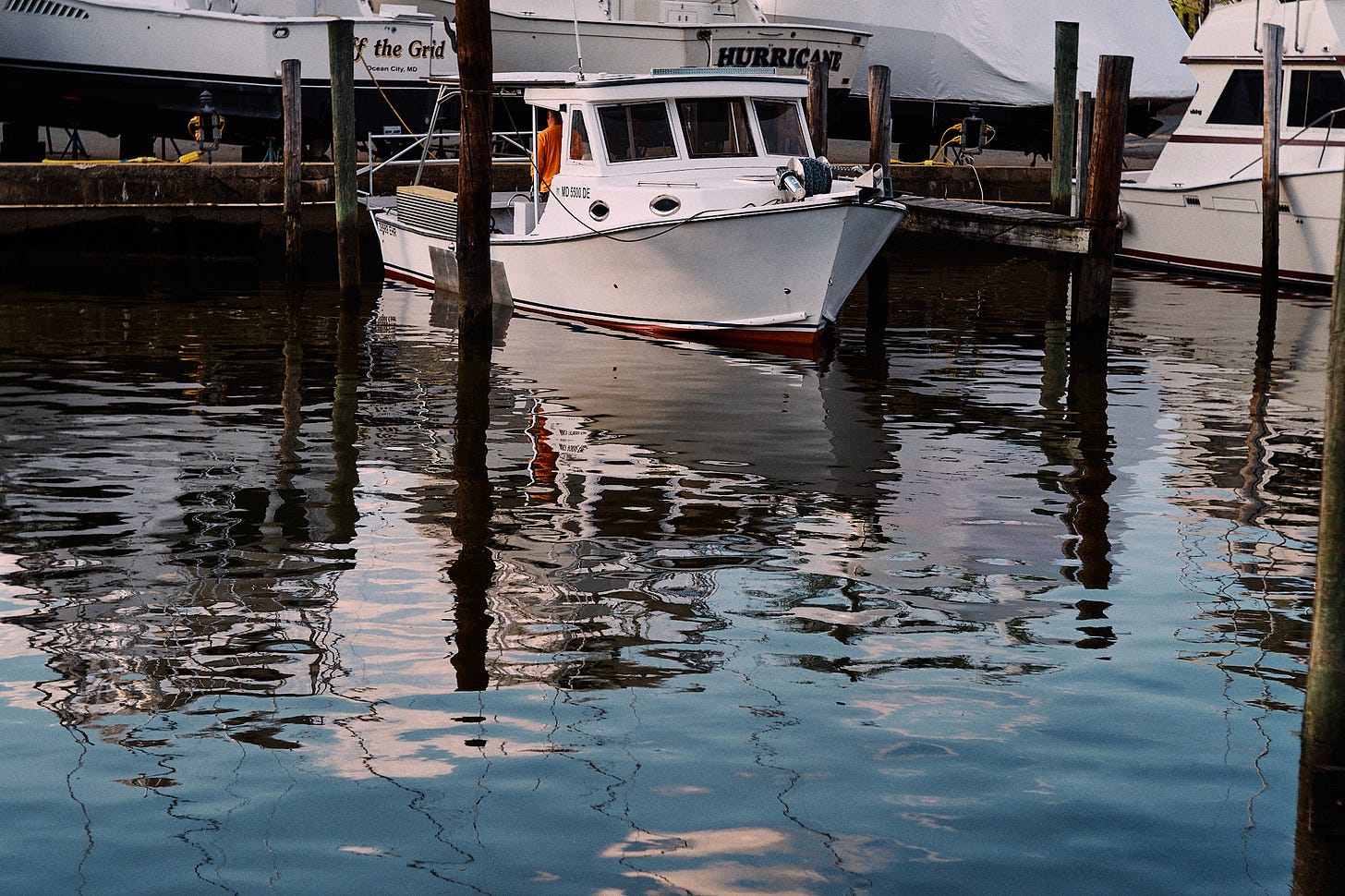
I already knew that was going to be a lot of cropping for me. I moved down the dock where I stood and reframed a tiny bit as my original perspective was exactly what I wanted. Above is the uncropped result. There we go, perfect and no cropping required. Some of you from some misguided point of view may say… but now you’ve got a ladder in the upper left corner, that’s a ”distraction”.
My response to that discussion would be, “who cares”. Maybe, I’d care if it were bright neon-green or lit up with those obnoxious purple LED lights that have become ubiquitous on YouTube. Where does that thought process end? Well, let’s get rid of the other ladders, and all those ropes, and the electrical cords, and the trees that are out of focus in the other corner, and all those other boats because they aren’t even whole boats like the obvious subject boat. After that we would start getting rid of reflections of things that we got rid of going down that road…
So which back-to-back frame do we select? The cropped version or the un-cropped version? If you answered, “the cropped version is the one to go with”, your thoughts would mirror mine. What would be the biggest reason you’d pick that one? Lack of ladder? As I said, who cares. My reason has everything to do with the man in the orange shirt and importantly his reflection. For me that orange shirt and secondarily it’s reflection is a super important compositional element between the two. If you picked the other one I guess you’d have to get rid of the remnants of the man in the orange shirt seen through the boat windows because the story is obviouly the boat without any people on it rather than the the boat in the boat yard with the single individual that is the focus and ultimate point of the frame I chose.
It’s your story, not some A.I. generated list of “distractions” that are actually context to some arbitrary notion of what makes a “good picture” or “good composition”. Most of my favorite photographs I’ve ever seen have a lot of context that would be sterile, lousy, product photographs with no energy and no life if subjected to some arbitrary micro analysis of “stuff in the frame” along with the healing brush and content aware generative AI fueled patch tool.
Workshop Update
All of our workshops are limited to 4 attendees so that no matter the topic we can take a deep dive into your work and make the experience truly collaborative for everyone. We do our best not to be a purely vocational or technical education but concentrate on all of the aspects of your photography.
Introduction to Fine Art Printing July 2024 edition - Sold out
Introduction to Fine Art Printing October 2024 edition - Sold out
Portfolio Workshop November 2024 edition - Only 1 spot left
Our portfolio workshop is a two month processes that culminates in a 3-day intensive workshop where you will learn editorial skills while producing an ultra quality print portfolio of your work in collaboration with other serious photographers. This workshop is truly unique and will benefit all your future work. We’ve been hosting this workshop annually for over ten years and all of our alumni are surprised at how this workshop has helped them grow as photographers and impact their work long after it has ended.
Introduction to Fine Art Printing Jan 2025 edition - Newly opened
Our classic Introduction to Fine Art Printing workshop sells out fast. As with all of our workshops this is far beyond a technical workshop. We’ve opened another one as early as we could next year.
As with all of our workshops, if you have questions or there is something you’d like to know before signing up shoot an email to lespicker@gmail.com.


Not sure you're asking, but here are my opinions... My very first impression was about the boat. It is the center of attention, and the closer crop seems too close for it. It needs some headspace, room to breathe. To me, the only distracting element is the word "Hurricane." However, if you remove the background in the upper right corner (and maybe the ladder), the the entire background is cleaner. Oh, and it took me a while to notice the piling in the lower right, but now that I have, I see it as a problem. Too bad, because I prefer the left-and-right cropping of that image, relative to the positioning of the boat.
It's tough sometimes! I go through this all the time.
I'd crop your top shot even more, showing the wharf poles and the 2 boat names in the rear with your subject boat more centered. Then your orange man, red boat edge at the water line and reflections dominate for a clearer story.