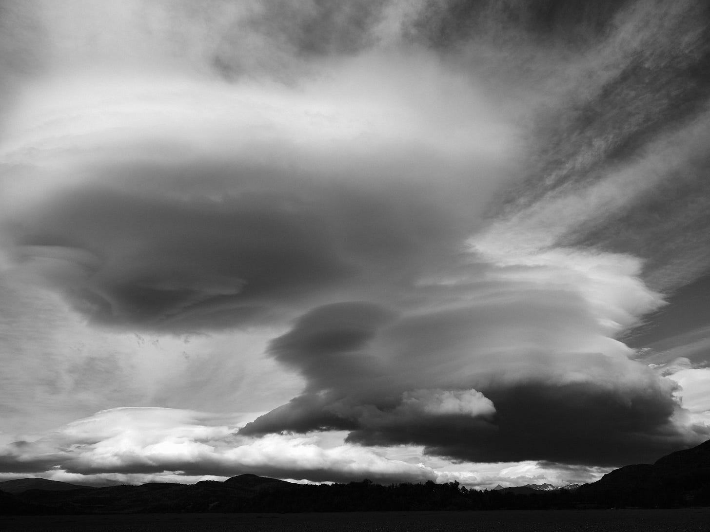
I'd like to get something off my chest, so here goes. Not every color image is good as a black and white (B&W) print.
This happens to Bob and I numerous times a year. In most cases it goes something like this. A photographer will come to us with a - quite frankly - mediocre B&W print and wants some help making it look better. When questioned, nine of ten times the backstory is that it was originally a color image, but it didn't look great to the photographer, so s/he converted it in post and printed it. So much garbage on the Internet seems to encourage this as a way to salvage a less-than-good image.
From my perspective there are certain images that will not convert well from color to B&W. For one, images that are not very good in color will rarely make a great B&W print. Monotone is no cure for poor composition, blurry images, indeterminate subject, or a host of other factors that can tank a B&W print (or a color print, for that matter). Unfortunately, as has happened to every one of us, concept and execution can end up being at odds. As the poet John Burns said:
“The best laid schemes o' mice an' men gang aft agley.”
Great B&W prints share some traits with color prints. Estimates are that we see more than 100,000 color images every day. Every time we turn our head, we see another color image. So without color in a print, there has to be something else, some secret sauce that grabs the viewer. Contrast, paterns, texture, lines, alluring subject, gripping story line, ... the list is long and subject to the artist's interpretation, of course.
But, if there is one thing I preach to aspiring B&W photographers, it's this. Shoot in B&W! I don't mean you need to go out and lay down five figures for the latest monochrome Leica. Many high-end mirrorless camera today have the ability to view the scene in B&W through the viewfinder. Every time I go out with the specific intent to shoot B&W, I switch my Fuji GFX to monochrome.
There is something in doing that which forces a paradigm shift in interpretating the scene. Suddenly you no longer have the distraction of color. You see pure light and shadow, the have full tonality before you that will help you judge and interpret the scene.
I urge you to try this and see for yourself what a difference that one simple technique can do for your photography in general, your B&W photography in particular and, most of all, your B&W prints.
For those of you who have exprtessed interest in our B&W workshops, stay tuned for announcements as we will be finalizing our workshop schedule for the Fall/winter 2023 and spring 2024.


I made some really good B&W from jazz photos but now reading your site and now setting camera to monochrome and thinking B&W, it's totally different and not so "easy." The results now seeing them in LR Classic are not rewarding, overall. Maybe you can help.
For one, being on travel not is not best scenario for choosing B&W. Then in LR the images appear in color. (I shoot RAW) so my mind sees it in color and travel is often "color".
2) Clicking LR B&W becomes Adobe Monochrome. Changing to Camera Monochrome seems better. What is your take on that?
3) For the photos that feel right for monochrome, I seems I need more adjustments than in color. Does that make sense? Maybe the shot was just not good enough. I assume you will agree.
4) That brings me to your point that when you are asked to put color into B&W to look "better" it seems the reverse. Poor color image is worse in B&W.
5) Some shots really did work in B&W such as a fortress from year 300 and for that this was a great exercise. Flowers well, they are in color.
All of the above is just seeing the images in LR. When I return home it's the print that will tell me if and what worked.
I look forward to your having more on B&W. Thanks for listening.
The comment made that color does not always translate to a good b/w image is true. Just the other day I was working with a color image and pushed the b/w button in RAW and it was a terrible image. If I do something in b/w that I want to have full tonality I will use Topaz B/W or Nik Silver Effects. There are plenty of choices and from one of the applications, you can manipulate from there.
Previsualization of the final image is an essential component to the final print. Dodging, burning and contrasts just like in the darkroom can really bring an image to life.